Add pop-up exhibits
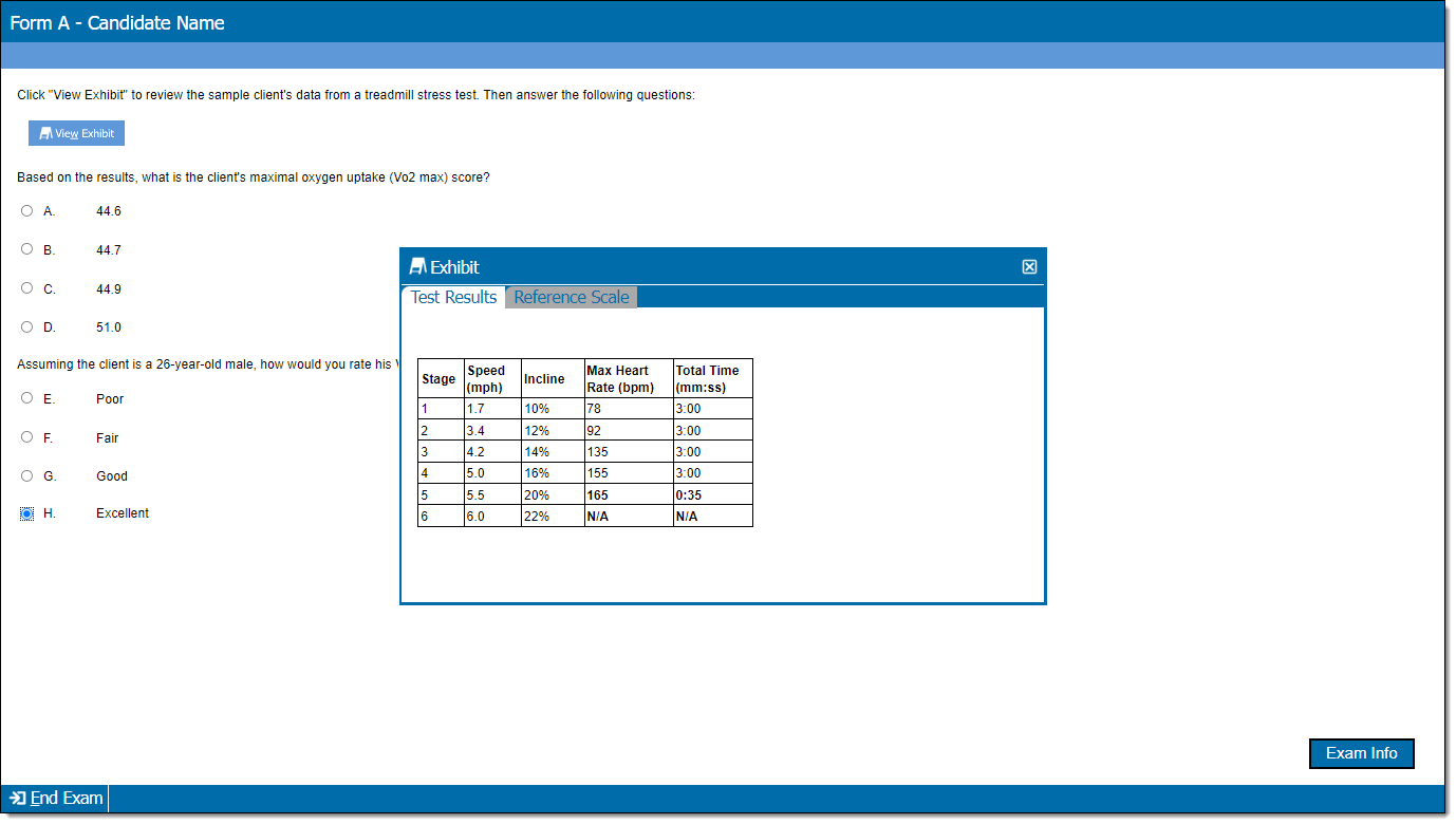
Exhibits provide candidates with supplemental information for exam items such as passages, tables, graphs, images, audio, and video. This page describes pop-up exhibits, which display content in a pop-up window when an exhibit button is clicked. (Split screen exhibits display content on the same page as the other item content.)
Add a pop-up exhibit
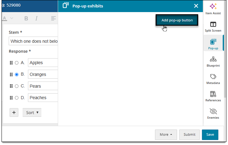
- In the item settings panel
 , click Pop-up.
 - In the Pop-up exhibits panel, click Add pop-up button. (Note: the item type template you're working with must be enabled for pop-up exhibits or you will not see this option.)
- A "Button 1" section is displayed ("Button" refers to what the candidate clicks during test delivery to access the exhibit content; see the section below describing how to add a button). Click inside the blank field and select Add a new exhibit or choose a recently edited exhibit if available.
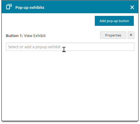
- The exhibit is added to the item and is also listed under "Button 1" in the Pop-up panel.
- Click Save in the lower-right corner of the page.
- A newly created exhibit is saved as a separate item and must be advanced through the item review process.
- A new exhibit can be added to other items or modified within other items, depending on a user's current assignments.
- You'll also need to insert the actual exhibit button above or below the item's content components. See the next section below for instructions.

 Your project may include multiple templates that can be used for exhibits. For example, some may allow media files or have more than one section for adding text. Click the item type drop-down menu
 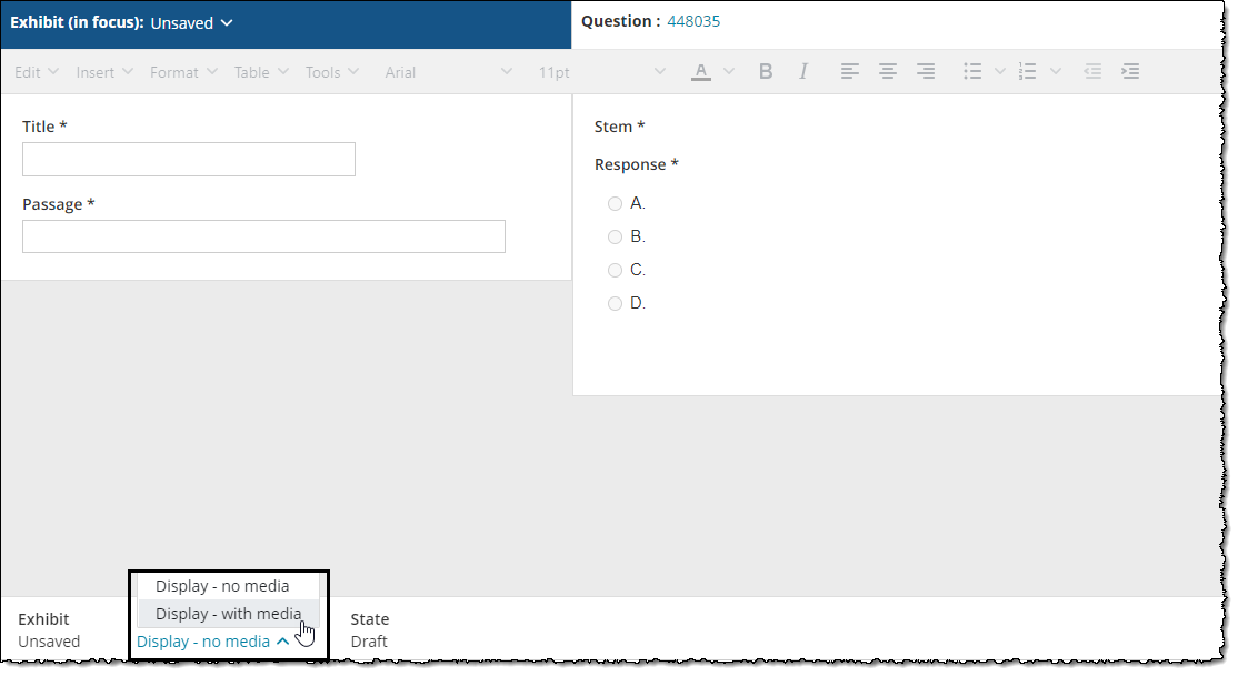 in the lower-left corner of the page to see if other templates are available.
|
|
Insert exhibit button above or below the content components
|
|
When you add pop-up exhibits to an item, you must also insert a button above or below the item's content components* that allows candidates to view the exhibit in a pop-up window during test delivery. You can add more than one button if the item contains multiple exhibits.
- To insert an exhibit button, click the Set as focus button in the Question header . (Skip this step if you are already editing the question and not the exhibit.)
- Click Insert pop-up button, hover over the button you want to insert, and choose Before Stem* or After Stem*.
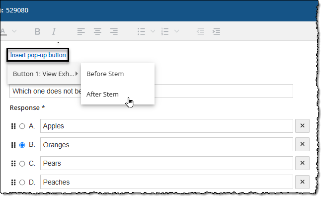
- The button is placed in the item according to your selection.
- The superscript number at the end of the button text identifies each button that has been added in the Exhibits panel. This helps you identify which button (and therefore which exhibits) you are inserting if you are adding multiple buttons. Note: Candidates do not see the superscript number on the button during test delivery; it is only shown during the authoring process.
- The button text (e.g., "View Exhibit"), which is visible to candidates, is initially configured by the item bank manager. Depending on your permissions, you may be able to change the text along with other button properties by clicking the Properties button in the Exhibits panel.

Add exhibit title and passage
|
*Note: The "title" and "passage" are the main content of an exhibit excluding the response options—such as text, tables, or media recordings. These fields may have a custom label. For example, "Question" or "Stem" may be used instead of "Title" or "Passage", depending on the item requirements within your project. |
- Click the Set as focus button in the Exhibit header . (Skip this step if you are already editing the question and not the exhibit.)
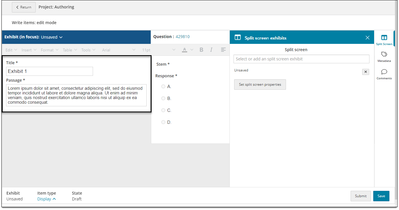
- In the exhibit editing area, enter the following information in the text fields:
- Title*: Enter a title for the exhibit. The title is only displayed to candidates if a pop-up window contains multiple exhibits on separate tabs.
- Passage*: Enter the exhibit text content (e.g., examples, case studies, descriptions, definitions, etc.).
Add tables, images, media, or equations
You can add tables, images, media files, and equations to the exhibit content. View these pages for more information:
If you don't see an option to add media files, check if other templates are available. To check for other templates, make sure the exhibit is set as the focus  and click the item type drop-down menu . If you still cannot add media, contact your item bank manager. (Media can only be added to exhibits if a Display item template configured for media is enabled in the project.)
Add more exhibits
You can add multiple exhibits to a single button, or add multiple buttons for one or more exhibits. (For example, you can display Exhibit 1 and Exhibit 2 on one button and Exhibit 3 on a second button.) Multiple exhibits on a single button are displayed as tabs in the exhibit pop-up window.
- Click the Set as focus button in the Question header . (Skip this step if you are already editing the question and not the exhibit.)
- In the item settings panel , click Pop-up.
- Follow the steps below to either add a new button or add more exhibits to an existing button.
Add another button
- Click Add pop-up button.
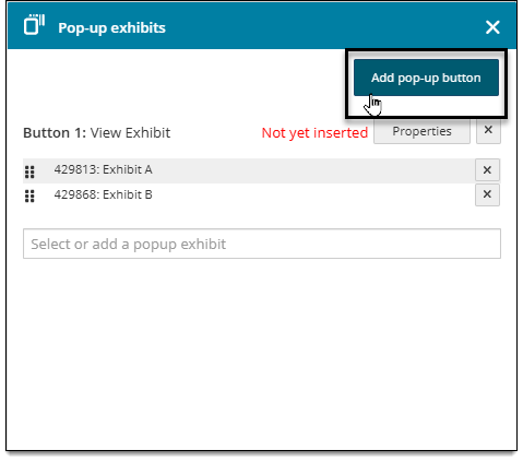
- Click inside the blank field under the new button and select Add a new exhibit or choose a recently edited exhibit.
- The exhibit is added to the item. To begin editing the exhibit content, click the Set as focus button in the Exhibit header .
- Insert the actual button in the item content components. (See Insert exhibit button above or below the content components above for details.)
Add more exhibits to an existing button
- Click inside the blank field under the desired button number (e.g., "Button 1"), and select Add a new exhibit or choose a recently edited exhibit.
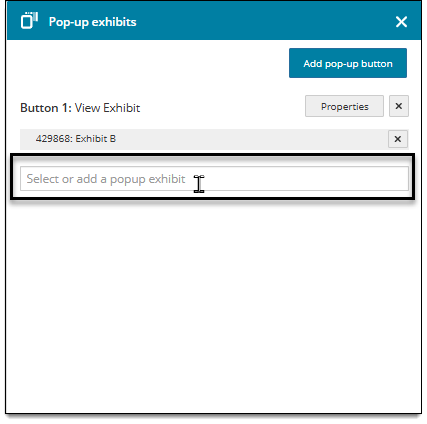
- The exhibit is added to the item. To edit the exhibit content, click the Set as focus button in the Exhibit header .
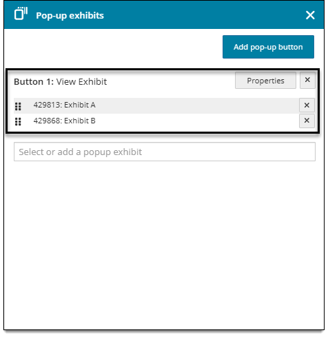
- You can see all exhibits added to a button under the button number in the Pop up panel:
Switch between exhibits when editing
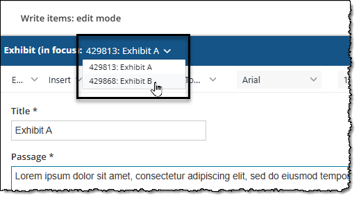
All exhibits are accessed in the same editing panel on the left side of the screen, regardless of which button they are assigned to. To switch between exhibits for editing:
- Click the drop-down menu in the Exhibit header to select which exhibit to edit. (You may need to click the Set as focus button in the Question header first.)
Change the display order of exhibits in the pop-up window
If a single button opens multiple exhibits, you can change the left-to-right tab order in which the exhibits are displayed to candidates in the pop-up window.
- Click the Set as focus button in the Question header . (Skip this step if you are already editing the question and not the exhibit.)
- In the item settings panel , click Pop-up.
- Click and drag the handles next to the exhibit name to rearrange them.
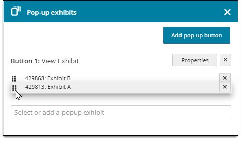
- The top-to-bottom order will translate to a left-to-right order in the pop-up window during test delivery. (The exhibit at the top of the list in the Exhibits panel will be displayed on the far left of the candidate's pop-up window, while the exhibit at the bottom of the list will display on the far right.)
Set pop-up exhibit properties
Choose where exhibits are placed in relation to the question content (orientation) or how much space the exhibits will occupy on the screen (ratio).
- Click the Set as focus button in the Question header . (Skip this step if you are already editing the question and not the exhibit.)
- In the item settings panel , click Pop-up.
- Click Properties.
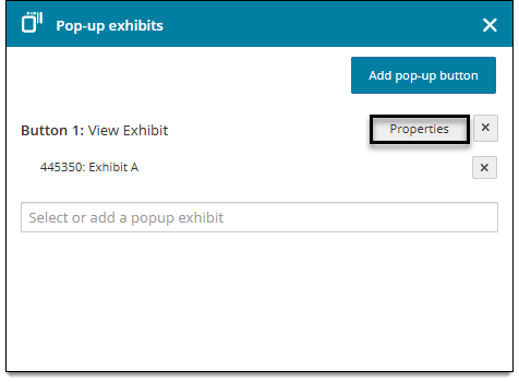
- Edit the following properties as needed.
- Button label: Enter text to be displayed on the button; for example, "View Exhibit". If you don't enter any text, the label will default to "Exhibit".
- Show button label: If True is selected, the text you entered in the Button label field will be displayed on the button. ("Exhibit" will be displayed if no text is entered for the Button label and Show button label is set to True.) If False is selected, the button will not show any text and only an icon will be displayed on the button.
- Button alignment: Choose an option to configure where the exhibit button is displayed on the screen during test delivery in relation to the item content components.
- Window title: Enter text to be displayed across the top of the exhibit pop-up window; for example, "Exhibit".
- Hotkey: Enter a single alphanumeric character that can be used in conjunction with the Alt key on the keyboard to open the exhibit.
- Require complete exhibit display: If True is selected, candidates must view all contents of the pop-up exhibit window (including all tabs if multiple exhibits are included) before they can select a response for the item. If False is selected, candidates are not required to open the exhibit or view all of the contents.
- Show background: If True is selected, the default background color of the button is displayed during test delivery. If False is selected, the default background color of the button is not displayed during test delivery (the button color is transparent).
- Show border: If True is selected, the border of the button is displayed during test delivery. If False is selected, the border is not displayed during test delivery.
- Window position: Choose an option to configure where the pop-up exhibit window is opened on the screen by default* when the exhibit button is clicked. For example, top-right opens the exhibit window in the top-right corner of the screen, while center-center opens the window in the center of the screen. Candidates can click and drag the pop-up window around the screen to the desired location.
- Window height: If desired, enter a specific height for the pop-up exhibit window. To use the default size, leave these fields blank. The values must be a non-zero integer; no decimals are permitted. The values you enter will specify a percentage of the screen resolution used during test delivery.
- Window width: If desired, enter a specific width for the pop-up exhibit window. To use the default size, leave these fields blank. The values must be a non-zero integer; no decimals are permitted. The values you enter will specify a percentage of the screen resolution used during test delivery.
- Button image: Click Browse to select an image to be displayed as the button (instead of displaying the default blue button). This is an item-level setting and cannot be applied at the template level.
- Rollover: Click Browse to select an image that will be displayed when a candidate's mouse pointer is hovered over the button. This is an item-level setting and cannot be applied at the template level.
- Click Apply.
Remove a pop-up exhibit
Remove an exhibit from the Pop-up panel
- Click the Set as focus button in the Question header . (Skip this step if you are already editing the question and not the exhibit.)
- in the Pop-up panel, click the delete
 button next to the exhibit that you want to delete.
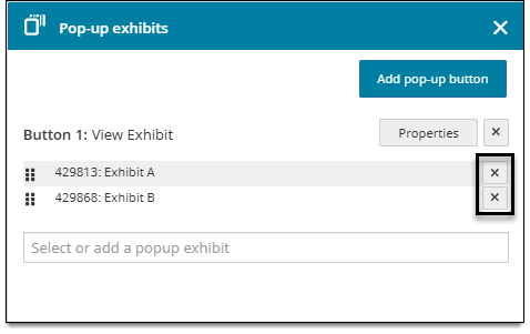
- Click Yes in the confirmation pop-up.
- If there are no exhibits left on the button, click the delete button next to the "Button" section name.
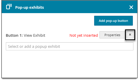
- If you removed he button section in step 4, proceed to the steps in the next section to remove the actual exhibit button from the item content components.
Remove the exhibit button from the item
- Click the Set as focus button in the Question header . (Skip this step if you are already editing the question and not the exhibit.)
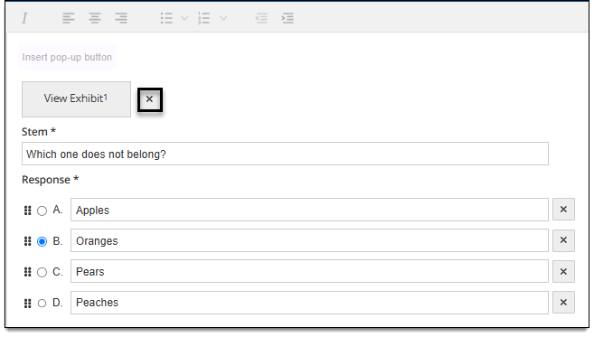
- In the content components area, click the delete button next to the button that you want to delete
Preview item with exhibits
Preview how the exhibit will appear alongside item content during exam delivery. This allows you to verify the size, order, and display or exhibit content and assets.
|
|
- In the lower right corner, click More > Preview.
- A preview of the exhibit will open in a new tab. The preview is displayed with the Exam Preview application and shows how the exhibit and item content will be displayed to candidates during exam delivery.