Workspace (item type)
|
|
Workspace item types display two distinct sides shown in a split screen; one side contains split screen exhibit content and the other side contains buttons for pop-up exhibits and responses. Both Essay and Spreadsheet response types can be used, and each Workspace item can include more than one response option (for example, the Workspace item can have one Essay response and one Spreadsheet response, two Essay responses, two Essay responses and a Spreadsheet response, etc.).
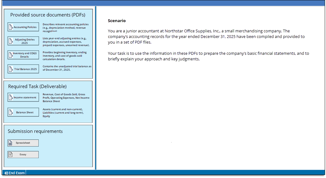
Change exhibit group label and settings
|
|
The exhibit group settings determine how the exhibit group area is visually displayed during exam delivery. You can define a background color and border to make each exhibit group appear visually distinct from other sections on the page, and update the header that is displayed for each exhibit group.
- Click the Set as focus button in the Question header
 . (Skip this step if you are already in the Question panel.)
 - In the Exhibit group label field, enter the label that will display as the header for the exhibit group.
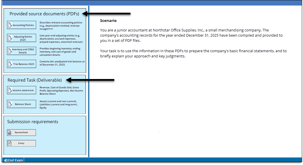
- Click the settings button
 located next to the Exhibit group label. (If you don't see a settings button, this means authors are not permitted to update exhibit group settings in this template.)
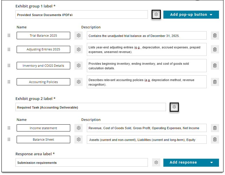
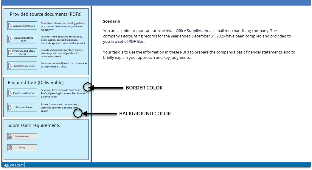
- Modify the following properties as needed:
- Background color: This changes the background color of the exhibit group area.
- Border color: This changes the color of the border that outlines the exhibit group area.

Add pop-up exhibits to an exhibit group
Each exhibit group can have one or more pop-up exhibits. To add exhibits, you must first add a button (which allows candidates to access the exhibit during exam delivery), and then edit the content of the pop-up exhibit.
Add a pop-up button
- Click the Set as focus button in the Question header . (Skip this step if you are already in the Question panel.)
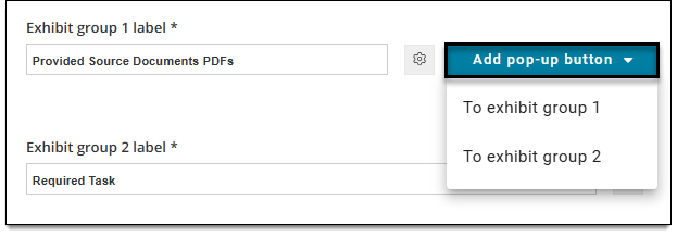
- Click the Add pop-up button menu and select which exhibit group to add it to (e.g.,To exhibit group 1).
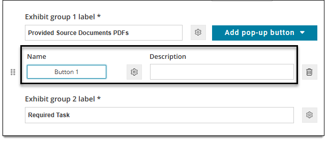
- Once a button is added, you will see a Button and Description added to the exhibit group.
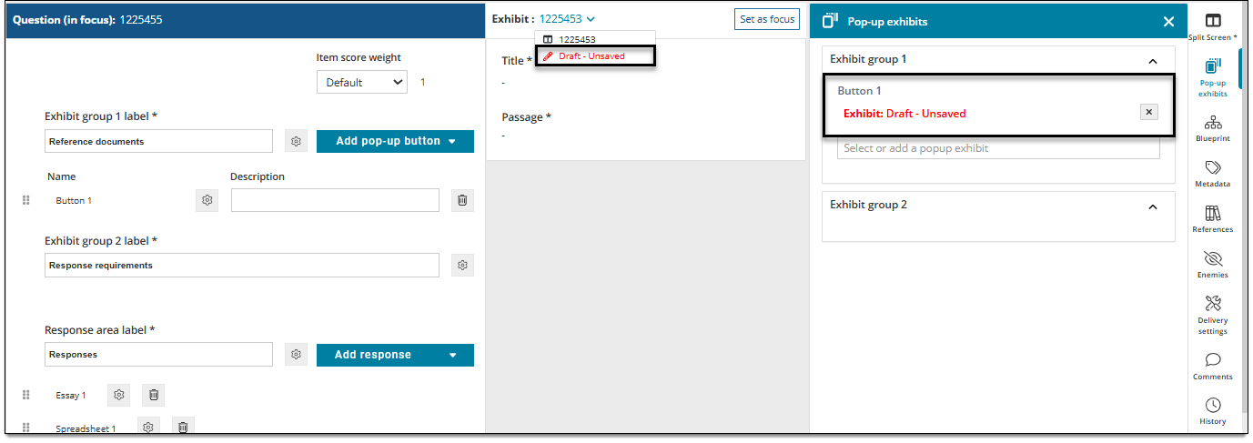
- Depending on the template settings, a draft pop-up exhibit may be added automatically. You can confirm this by clicking the drop-down menu in the Exhibit header and checking for a Draft- unsaved exhibit or check for Exhibit: Draft unsaved for the button in the Popup exhibits panel.
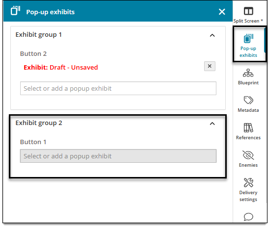
- If no draft exhibit is created, click Pop-up exhibits in the item settings panel . Then click inside the Button field to Select or add a popup exhibit.
- Depending on the template settings, a draft pop-up exhibit may be added automatically. You can confirm this by clicking the drop-down menu in the Exhibit header
- Double-click the button text to change its label. For example, the default label is "Button 1", but you can change this to "View exhibit" or the name of the reference material that will be provided in the exhibit, such as "Accounting Policies".
- In the Description field, enter text that will display next to the button. This text is used to describe what candidates will expect to see when they click the button to view the exhibit. For example, "Describes relevant accounting policies (such as depreciation method, revenue recognition, etc.)."


Change the pop-up exhibit button and window properties
|
|
- Click the Settings button located next to the pop-up button.
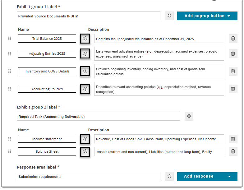
- Modify the Button properties and Window properties as desired.
- Button properties - Style & interactionButton properties - Style & interaction
- Show: Select the checkbox for the corresponding button settings that should be visible to the candidate during delivery. If left unchecked/not selected, the button setting won't show during delivery.
- Label: Enter a custom label for the button. (The default is "Button 1", "Button 2", etc.)
- Normal image: Click Browse to choose an image. The image will be displayed to the left of the button label when a candidate is not hovering over the button.
- Background color: Input a color's hex number or click the color swatch to select a color or enter RGB values. This changes the color of the button.
- Border color: Input a color's hex number or click the color swatch to select a color or enter RGB values. This changes the color of the button border.
- Rollover image: Click Browse to choose an image. The image will be displayed when a candidate hovers their mouse pointer over the button.
- Rollover color: Input a color's hex number or click the color swatch to select a color or enter RGB values. This changes the color of the button text when a candidate hovers their mouse pointer over the button.
- Foreground color: Input a color's hex number or click the color swatch to select a color or enter RGB values. This changes the color of the button text when a candidate is not hovering their mouse pointer over the button.
- Hotkey: You can designate a single alphanumeric value that can be used with the ALT key to open a pop-up exhibit without clicking the button. For example, if you designate "E", candidates will press ALT + E on their keyboard to open the pop-up exhibit.
- Show: Select the checkbox for the corresponding button settings that should be visible to the candidate during delivery. If left unchecked/not selected, the button setting won't show during delivery.
- Button properties - Dimension & positioningButton properties - Dimension & positioning
- Height, Width: Specify the pixel height and width of the button. This can be any non-zero integer (1 or more) or it can be left blank. If left blank, the button is displayed using the default settings. The button auto-sizes to the Button label or Normal Image size if the Width and Height are not defined.
- Label alignment: Choose Left, Center, or Right to align the label text with the button. (For example, Center will align the button label text in the center of the button.)
- Window properties - Style & interactionWindow properties - Style & interaction
- Title: Enter text to be displayed across the top of the exhibit pop-up window; for example, "Reference A".
- Require complete exhibit display: If you select True, candidates must view all contents of the pop-up exhibit window (including all tabs if multiple exhibits are included) before they can select a response for the item. If you select False, candidates are not required to open the exhibit or view all of the contents.
- Window properties - Dimension & positioningWindow properties - Dimension & positioning
- Height, Width: Enter a height and width to specify the percentage of the screen resolution to be used during exam delivery.
- Position: Choose an option to configure where the pop-up exhibit window is opened on the screen by default* when the exhibit button is clicked. For example, top-right opens the exhibit window in the top-right corner of the screen, while center-center opens the window in the center of the screen. (*Candidates can click and drag the pop-up window around the screen to the desired location.)
- Button properties - Style & interactionButton properties - Style & interaction
Edit the pop-up exhibit content
In order to edit the content of the exhibit itself (not the button), you must switch to the exhibit panel of hte item template.
 Although you are authoring the exhibit within a panel, candidates will still see the exhibit in a pop-up window during delivery.
- Click the Set as focus button in the Exhibit header .
- Click the Exhibit drop-down to select the exhibit you want to edit. (To verify which exhibit you are editing, click Pop-up exhibits in the item settings panel .)
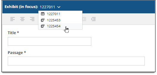
- Enter a Title for the exhibit.
- The title is only displayed to candidates if more than one exhibit is added to an item. Multiple exhibits are shown as tabs in the exhibits panel, and the title is displayed as the label for each tab.
- Enter the remaining exhibit content in the Passage* field.
- *The label for this field can be changed in your Display template but the new label will apply to all exhibits (split screen or popup) in the Workspace item.
- View this page for more information on pop-up exhibits, such as adding PDF and image assets.
Add additional pop-up exhibits
- Click the Set as focus button in the Question header . (Skip this step if you are already in the Question area.)
- Follow the previous steps starting with Add a pop-up button ↑ above to add more exhibits to an exhibit group.
Rearrange exhibits within the exhibit group
- If an exhibit group has two or more exhibits, click and drag the handles next to the exhibit buttons to rearrange them.
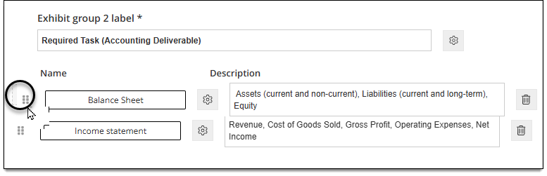
- This determines the vertical order in which the exhibits are displayed to candidates during delivery.
Delete an exhibit from an exhibit group
- Click the Delete button
 for an exhibit to remove it from the group.
 - Once the item is saved, the exhibit will no longer be displayed in the item.
Change the response area label and settings
|
|
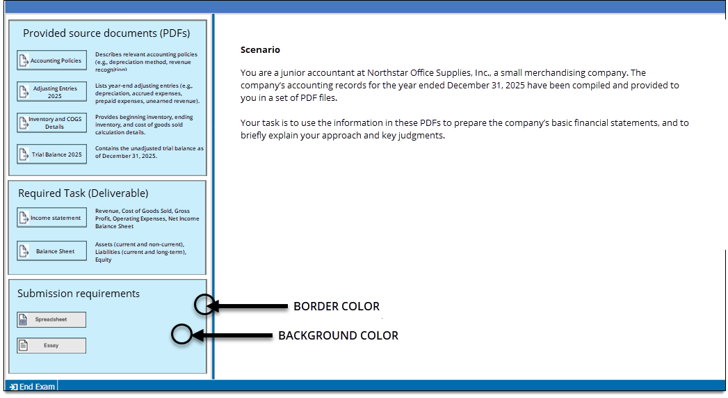
The response area settings determine how the response area is visually displayed during exam delivery. You can define a background color and border to make this area appear visually distinct from the exhibit group areas, and update the header that is displayed.
- Click the Set as focus button in the Question header . (Skip this step if you are already in the Question panel.)
- In the Response area label field, enter the label that will display as the header for the response area.
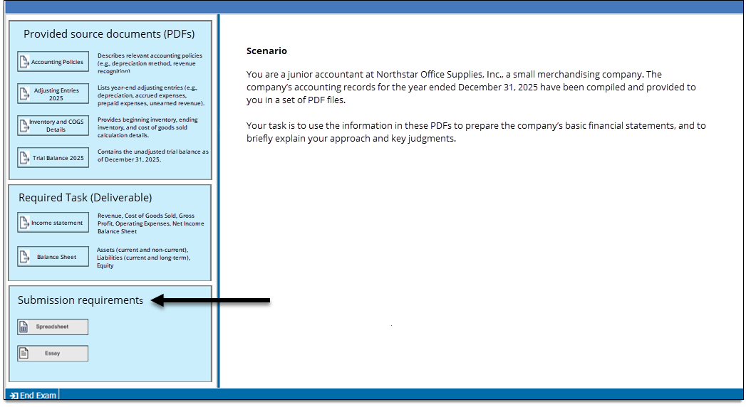
- Click the settings button located next to the Response area label. (If you don't see a settings button, this means authors are not permitted to update response area settings in this template.)
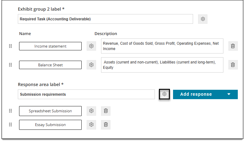
- Modify the following properties as needed:
- Background color: This changes the background color of the response area.
- Border color: This changes the color of the border that outlines the response area.
Add an Essay response
Add an Essay response button
- Click the Set as focus button in the Question header . (Skip this step if you are already in the Question panel.)
- In the Response area (located beneath the exhibit groups), click the Add response menu and choose Essay.
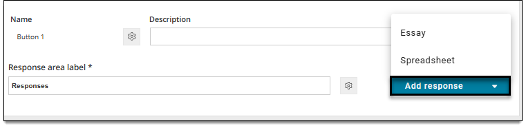
- An Essay button is added to the Response area.
- Double-click the button text to change its label. For example, the default label is "Essay", but you can change this to something else such as "Word processor".
Change the Essay button and window settings
|
|
- Click the settings button located next to the Essay button.
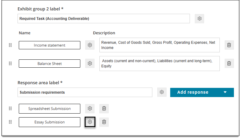
- Modify the Button properties Window properties, and Essay properties as desired.
- Button properties - Style & interactionButton properties - Style & interaction
- Show: Select the checkbox for the corresponding button settings that should be visible to the candidate during delivery. If left unchecked/not selected, the button setting won't show during delivery.
- Label: Enter a custom label for the button. (The default is "Button 1", "Button 2", etc.)
- Normal image: Click Browse to choose an image. The image will be displayed to the left of the button label when a candidate is not hovering over the button.
- Background color: Input a color's hex number or click the color swatch to select a color or enter RGB values. This changes the color of the button.
- Border color: Input a color's hex number or click the color swatch to select a color or enter RGB values. This changes the color of the button border.
- Rollover image: Click Browse to choose an image. The image will be displayed when a candidate hovers their mouse pointer over the button.
- Rollover color: Input a color's hex number or click the color swatch to select a color or enter RGB values. This changes the color of the button text when a candidate hovers their mouse pointer over the button.
- Foreground color: Input a color's hex number or click the color swatch to select a color or enter RGB values. This changes the color of the button text when a candidate is not hovering their mouse pointer over the button.
- Hotkey: You can designate a single alphanumeric value that can be used with the ALT key to open a pop-up exhibit without clicking the button. For example, if you designate "E", candidates will press ALT + E on their keyboard to open the pop-up exhibit.
- Show: Select the checkbox for the corresponding button settings that should be visible to the candidate during delivery. If left unchecked/not selected, the button setting won't show during delivery.
- Button properties - Dimension & positioningButton properties - Dimension & positioning
- Height, Width: Specify the pixel height and width of the button. This can be any non-zero integer (1 or more) or it can be left blank. If left blank, the button is displayed using the default settings. The button auto-sizes to the Button label or Normal Image size if the Width and Height are not defined.
- Label alignment: Choose Left, Center, or Right to align the label text with the button. (For example, Center will align the button label text in the center of the button.)
- Window properties - Style & interactionWindow properties - Style & interaction
- Title: Enter text to be displayed across the top of the exhibit pop-up window; for example, "Reference A".
- Require complete exhibit display: If you select True, candidates must view all contents of the pop-up exhibit window (including all tabs if multiple exhibits are included) before they can select a response for the item. If you select False, candidates are not required to open the exhibit or view all of the contents.
- Window properties - Dimension & positioningWindow properties - Dimension & positioning
- Height, Width: Enter a height and width to specify the percentage of the screen resolution to be used during exam delivery.
- Position: Choose an option to configure where the pop-up exhibit window is opened on the screen by default* when the exhibit button is clicked. For example, top-right opens the exhibit window in the top-right corner of the screen, while center-center opens the window in the center of the screen. (*Candidates can click and drag the pop-up window around the screen to the desired location.)
- Essay propertiesEssay properties
See the Essay topic for details on these fields.
- Button properties - Style & interactionButton properties - Style & interaction
Edit the Essay response box
- Click the Essay button to open the Essay response window.
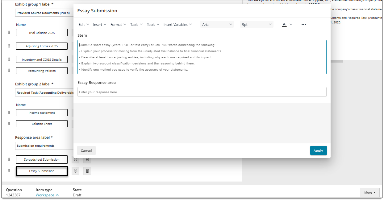
- See the Essay topic for details on editing Essay items.
Add additional Essay responses
- In the Response area (located beneath the exhibit groups), click the Add response menu and choose Essay.
- Follow the previous steps above to configure the additional Essay responses.
Rearrange responses within the response area
- If the response area has two or more responses, click and drag the handles next to the response buttons to rearrange them.
- This determines the vertical order in which the response buttons are displayed to candidates during delivery.
Delete an Essay response
- Click the Delete button for an Essay response to remove it from the response area.
- Once the item is saved, the Essay response button will no longer be displayed in the item.
Add a Spreadsheet response
Add a Spreadsheet response button
- Click the Set as focus button in the Question header . (Skip this step if you are already in the Question panel.)
- In the Response area (located beneath the exhibit groups), click the Add response menu and choose Spreadsheet.
- A Spreadsheet button is added to the Response area.
- Double-click the button text to change its label. For example, the default label is "Spreadsheet", but you can change this to something else such as "Data".
Change the Spreadsheet button and window settings
|
|
- Click the settings button located next to the Spreadsheet button.
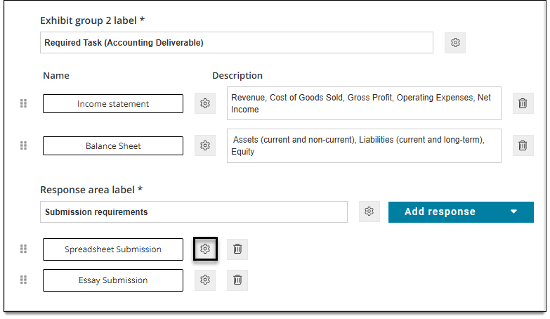
- Modify the Button properties Window properties, and Spreadsheet properties as desired.
- Button properties - Style & interactionButton properties - Style & interaction
- Show: Select the checkbox for the corresponding button settings that should be visible to the candidate during delivery. If left unchecked/not selected, the button setting won't show during delivery.
- Label: Enter a custom label for the button. (The default is "Button 1", "Button 2", etc.)
- Normal image: Click Browse to choose an image. The image will be displayed to the left of the button label when a candidate is not hovering over the button.
- Background color: Input a color's hex number or click the color swatch to select a color or enter RGB values. This changes the color of the button.
- Border color: Input a color's hex number or click the color swatch to select a color or enter RGB values. This changes the color of the button border.
- Rollover image: Click Browse to choose an image. The image will be displayed when a candidate hovers their mouse pointer over the button.
- Rollover color: Input a color's hex number or click the color swatch to select a color or enter RGB values. This changes the color of the button text when a candidate hovers their mouse pointer over the button.
- Foreground color: Input a color's hex number or click the color swatch to select a color or enter RGB values. This changes the color of the button text when a candidate is not hovering their mouse pointer over the button.
- Hotkey: You can designate a single alphanumeric value that can be used with the ALT key to open a pop-up exhibit without clicking the button. For example, if you designate "E", candidates will press ALT + E on their keyboard to open the pop-up exhibit.
- Show: Select the checkbox for the corresponding button settings that should be visible to the candidate during delivery. If left unchecked/not selected, the button setting won't show during delivery.
- Button properties - Dimension & positioningButton properties - Dimension & positioning
- Height, Width: Specify the pixel height and width of the button. This can be any non-zero integer (1 or more) or it can be left blank. If left blank, the button is displayed using the default settings. The button auto-sizes to the Button label or Normal Image size if the Width and Height are not defined.
- Label alignment: Choose Left, Center, or Right to align the label text with the button. (For example, Center will align the button label text in the center of the button.)
- Window properties - Style & interactionWindow properties - Style & interaction
- Title: Enter text to be displayed across the top of the exhibit pop-up window; for example, "Reference A".
- Require complete exhibit display: If you select True, candidates must view all contents of the pop-up exhibit window (including all tabs if multiple exhibits are included) before they can select a response for the item. If you select False, candidates are not required to open the exhibit or view all of the contents.
- Window properties - Dimension & positioningWindow properties - Dimension & positioning
- Height, Width: Enter a height and width to specify the percentage of the screen resolution to be used during exam delivery.
- Position: Choose an option to configure where the pop-up exhibit window is opened on the screen by default* when the exhibit button is clicked. For example, top-right opens the exhibit window in the top-right corner of the screen, while center-center opens the window in the center of the screen. (*Candidates can click and drag the pop-up window around the screen to the desired location.)
- Spreadsheet propertiesSpreadsheet properties
See the Spreadsheet topic for details on these fields.
- Button properties - Style & interactionButton properties - Style & interaction
Edit the Spreadsheet response box
- Click the Spreadsheet button to open the Spreadsheet response window.
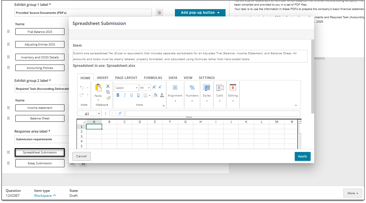
- See the Spreadsheet topic for details on editing Spreadsheet items.
Add additional Spreadsheet responses
- In the Response area (located beneath the exhibit groups), click the Add response menu and choose Spreadsheet.
- Follow the previous steps above to configure the additional Spreadsheet responses.
Rearrange responses within the response area
- If the response area has two or more responses, click and drag the handles next to the response buttons to rearrange them.
- This determines the vertical order in which the response buttons are displayed to candidates during delivery.
Delete a Spreadsheet response
- Click the Delete button for a Spreadsheet response to remove it from the response area.
- Once the item is saved, the Spreadsheet response button will no longer be displayed in the item.
Edit split screen exhibits (exhibits not in an exhibit group)
The steps below refer to the split screen exhibit panel that is shown on the opposite side of the screen from the question panel that contains exhibit groups and responses.
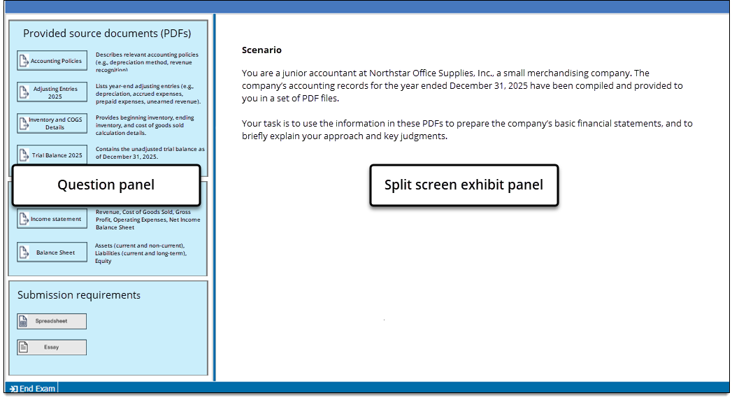
- Click the Set as focus button in the Exhibit header .
- Click the Exhibit drop-down to select the split-screen exhibit you want to edit.
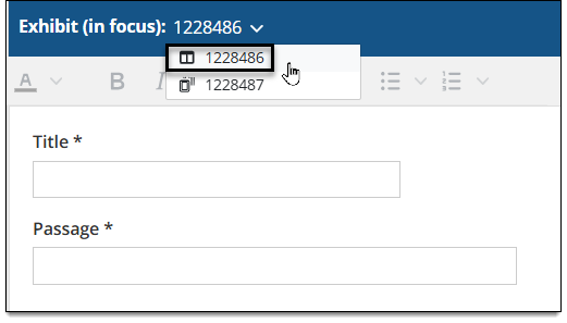
- Enter a Title for the exhibit.
- The title is only displayed to candidates if more than one exhibit is added to an item. Multiple exhibits are shown as tabs in the exhibits panel, and the title is displayed as the label for each tab.
- Enter the remaining exhibit content in the Passage* field.
- *The label for this field can be changed in your Display template but the new label will apply to all exhibits (split screen or popup) in the Workspace item.
- View this page for more information on split screen exhibits, such as adding PDF and image assets.
Add additional split screen exhibits (exhibits not in an exhibit group)
All split screen exhibits will be shown on the opposite side of hte screen from the pop-up exhibit groups and responses. If you add more than one split screen exhibit, they will be shown as tabs within the split screen side of hte screen during exam delivery.
- In the item settings panel , click Split screen.
- In the Split screen exhibits panel, click inside the text field and select Add a new exhibit or choose a recently edited exhibit if available.
- See this page for more information on split screen exhibits, such as adding PDF and image assets.
How the item is scored
Workspace items are only scored manually. (They are not scored by the test driver.) No scoring rules such as dichotomous or polytomous are used,