Workspace (item type template)
This page describes the configurations for the Workspace  item type template.
|
|
|
|

Workspace tab
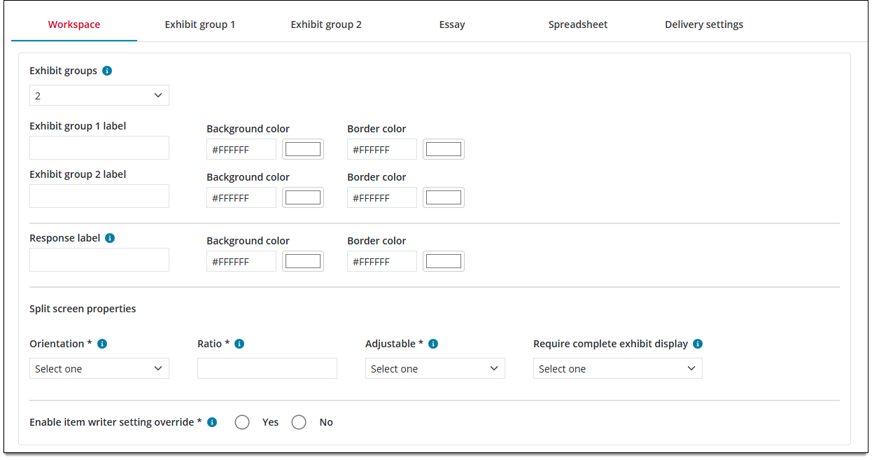
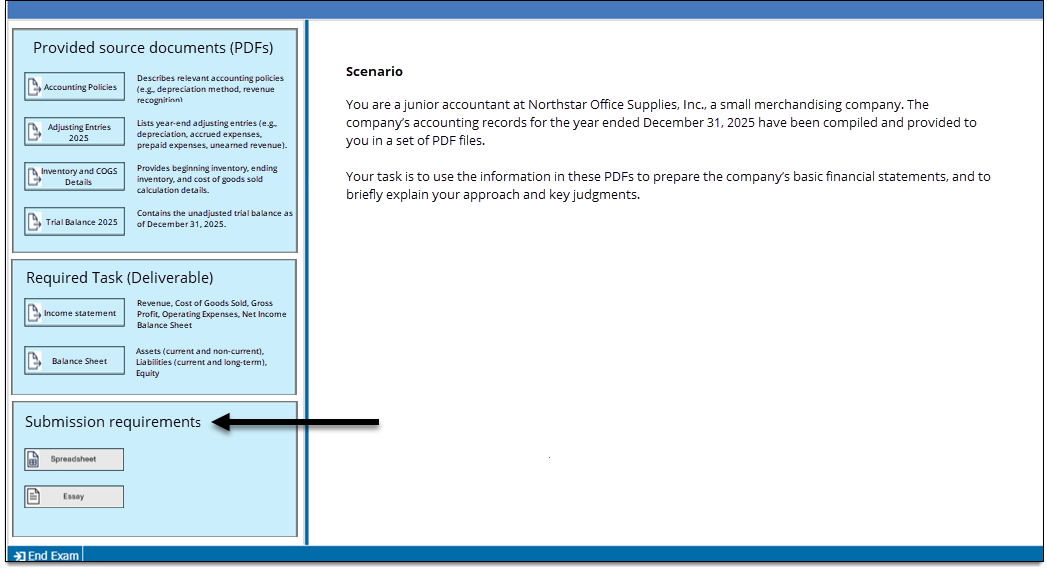
Set the number of exhibit groups, the label and colors for each exhibit group, and the properties for the default split-screen exhibit. Determine if authors can change certain properties of the item template.
|
Field |
Description |
|---|---|
| Exhibit groups |
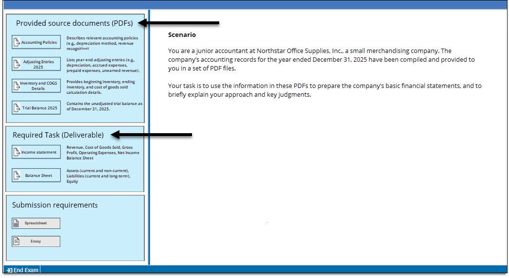
The number of exhibit groups enabled for the item type. (An 'exhibit group' is a visually distinct area containing one or more pop-up exhibits.)
|
| Exhibit group label |
The label for the exhibit group that will be displayed to the candidate during delivery.
|
| Background color, Border color |
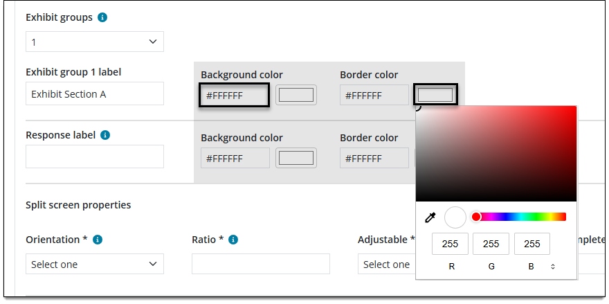
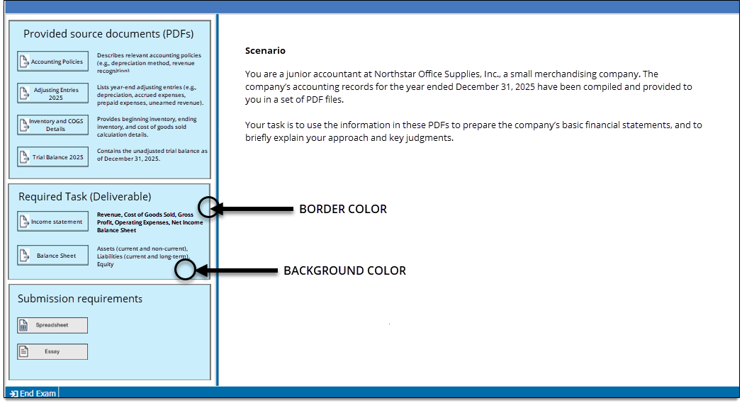
Optionally, you can set a Background color and Border color to visually separate each exhibit group. This is not required; the default colors are white.
In the left text box field, enter a hex color number or click the color swatch to select a color or enter RGB values.
|
| Response label |
The label for the response area that will be displayed to the candidate during delivery. The response area contains buttons for the Spreadsheet and/or Essay responses that candidates are required to submit.
|
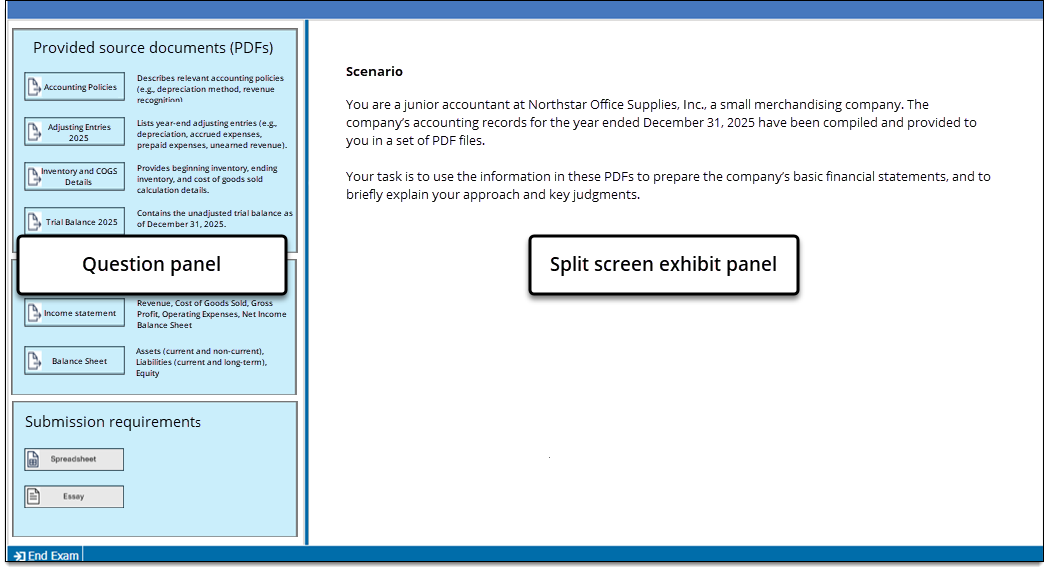
| Split screen properties |
Specify the properties for the default split screen exhibit panel.
Split screen properties
|
| Dynamic text allowed in content components |
Specifies whether authors can insert predefined scripts in the text components of items. When an item contains dynamic text, the content changes dynamically during exam delivery based on the script. For example, you might have dynamic content in question stems or multiple choice response options, or on display screens such as exam intros.
|
| Enable item writer setting override |
Specify Yes if authors should be allowed to change the properties listed below. This adds multiple Settings buttons
If No is selected, the Settings buttons |
 to the item template in Authoring that allow authors to change these properties at the item level.
Exhibit group tabs
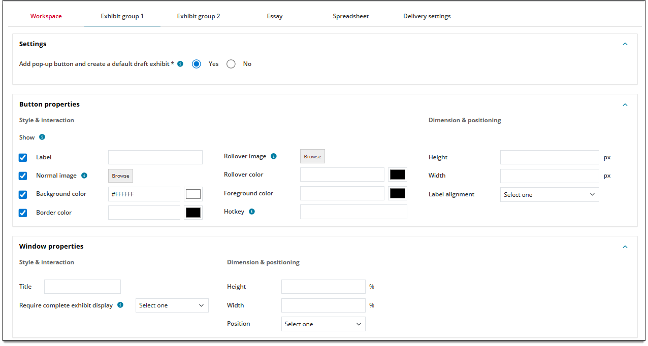
Choose button and window properties for each exhibit group. A separate tab will be added based on the number of exhibit groups you selected on the Workspace tab ↑.
|
Field |
Description |
|---|---|
| Settings |
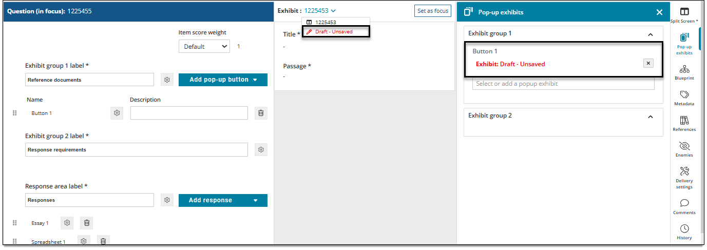
Add pop-up button and create a default draft exhibit
|
| Button properties - Style & interaction |
|
| Button properties - Dimension & positioning |
|
| Window properties - Style & interaction |
|
| Window properties - Dimension & positioning |
|
Essay tab
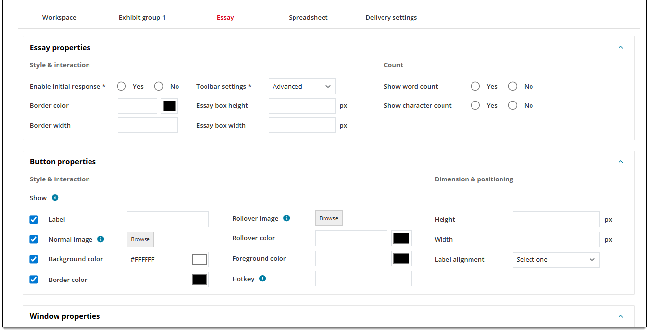
Choose button, window, and Essay response properties for the Essay response box.
|
Field |
Description |
|---|---|
| Essay properties |
Refer to the Essay topic for details on these fields. Only select fields from the Essay template can be configured in the Workspace template. |
| Button properties - Style & interaction |
|
| Button properties - Dimension & positioning |
|
| Window properties - Style & interaction |
|
| Window properties - Dimension & positioning |
|
Spreadsheet tab
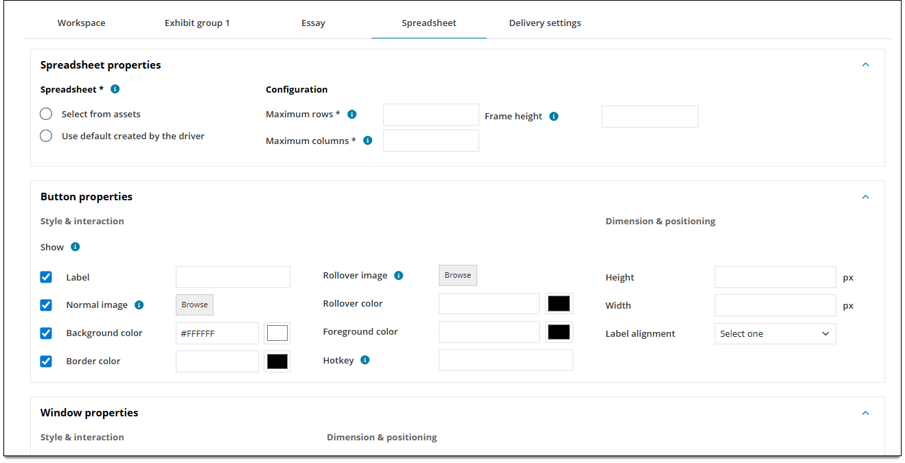
Choose button, window, and Spreadsheet response properties for the Spreadsheet response box.
|
Field |
Description |
|---|---|
| Spreadsheet properties |
Refer to the Spreadsheet topic for details on these fields. Only select fields from the Spreadsheet template can be configured in the Workspace template. |
| Button properties - Style & interaction |
|
| Button properties - Dimension & positioning |
|
| Window properties - Style & interaction |
|
| Window properties - Dimension & positioning |
|
Delivery settings tab (optional)
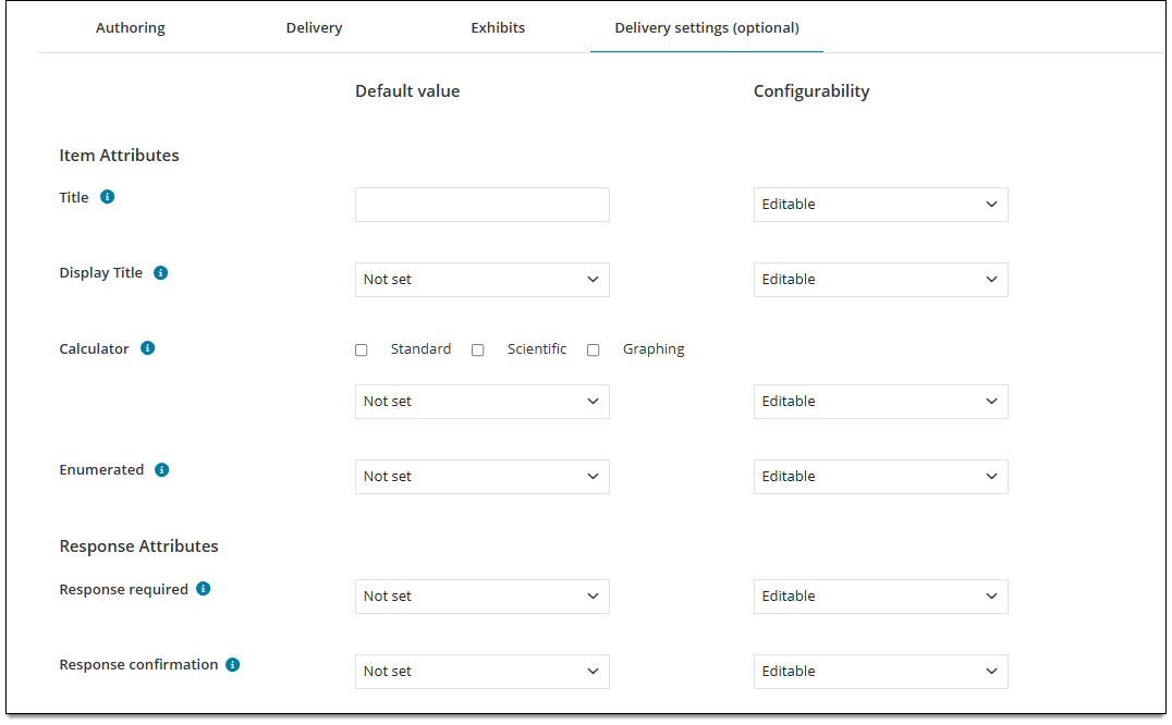
Choose default settings for item and response attributes that are used or displayed during exam delivery, such as shuffled responses, response confirmations, and calculators.
Item attributes
 Any field with a Configurability set as Select one will be hidden from writers and reviewers at the item level. (Project Managers will always see it.)
|
Field |
Description |
|---|---|
| Title |
Default value
Configurability
|
| Display title |
Default value
Configurability
|
| Calculator |
Default value
Configurability
|
| Enumerated |
Default value
Configurability
|
Response attributes
|
Field |
Description |
|---|---|
| Shuffle response |
Default value Determines if the 'shuffle response' feature is enabled for this item.
Configurability
|
| Response required |
Default value Determines if the candidate must enter a complete response for the item before navigating away from it.
Configurability
|
| Response confirmation |
Default value Determines if candidates will be prompted to confirm their answer to an item before navigating away from it. This is often used for exams that don't allow candidates to go back to an item once it has been answered.
Configurability
|
| No response confirmation |
Default value Determines if the candidate must enter a complete response for the item before navigating away from it.
Configurability
|