Hot Spot/Hot area (item type template)

This page describes the configurations for the Hot Spot/Hot Area  item type template. 

Note If new options have been added to this template since you last updated it, a notification is displayed to authors indicating that the template has not been updated. This notification will be displayed in Authoring until you enable or disable any new options and save the changes. 

Authoring tab

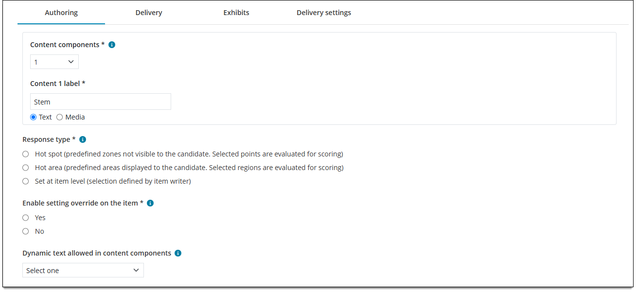
Specify the number and type of Content components, choose the response type (hot spot or hot area) and whether authors are allowed to edit the response type, resolution, and scoring rules.
Field

Description

Content components

The number of Content components enabled for the item type. A 'Content component' is a distinct area containing either text and images (such as the question or stem) or media files (such as audio and video).

  • Note Response options are not part of Content components. 
  • Note The order of Content components in the template is the order in which they will display to candidates. 
  • Note Authors are required to add content to Text components, but are only required to add content to Media components if the validation is enabled on the Media properties tab. (Validations are enforced upon submit, not save.)
Content label 

The Content component label and the type of content to be provided (text or media). The Content label acts as a header for the content section so the author knows what content to add (such as "Introduction", "Question", "Video", etc.).  

  • Note This label is not shown to candidates during test delivery. 
  • Note The type (Text or Media) indicates what type of content is allowed for that component. Text components can include text or images. Media components can be configured for audio, video, or both. 
  • Note Authors can only add one media file per Media component. If multiple media files are required, you must add multiple Media components to the template. 
Response type

The type of response selection for the item. Note Authors can change this setting if Yes is selected on the Authoring tab for Enable setting override on the item ↓. 

  • Hot spot: allows candidates to select one or more specific spots anywhere on the image, but only the 'hot spots' defined by the item author will be marked as correct. The hot spots defined by the author are not visible to the candidate. When the candidate clicks on a spot in the image during exam delivery, an "X" is placed where they clicked.
  • Hot area: allows candidates to select defined areas on the image. The hot spot areas defined by the author are visible to the candidate when the candidate's mouse is hovered over the area. If the candidate clicks a hot area, the area is displayed as highlighted and selected.
  • Set at item level: The author must choose the response type. Authors cannot submit the item until a response type has been selected. 
    • Note Set at item level will be the configured response type for this template, but imported items will inherit their original response type at the item level. For example, if an imported Point and Click item's response type was previously set to Hot Spot, this response type will be applied to the specific item once migration is complete —  instead of being set to Hot Spot at the template level.
Enable setting override on the item

Specify whether to allow authors to modify the response type, resolution, scoring rules. 

  • Yes: Authors can modify the Response type (Hot spot or Hot Area), Scoring rules (Dichotomous, Advanced, or No Scoring), and/or Resolution of the image display. 
  • No: Authors cannot modify the Response type, Scoring rules, and/or Resolution. (The options will be hidden.) 
Dynamic text allowed in content components

Specifies whether authors can insert predefined scripts in the text components of items. When an item contains dynamic text, the content changes dynamically during exam delivery based on the script. For example, you might have dynamic content in question stems or multiple choice response options, or on display screens such as exam intros.

  • Yes: Authors can insert dynamic text in certain text components (such as the item stem). 
  • No: Authors cannot insert dynamic text anywhere in the item. 

Delivery tab

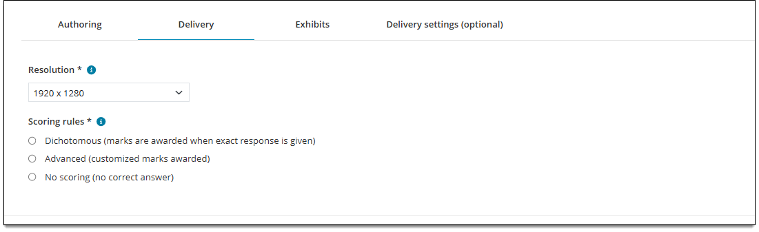
Specify the resolution for the hot spot/hot area image and choose scoring rules for the item. 
Field

Description

Resolution

The resolution of the image editing area (for item authors) and image display during exam delivery. 

Choose from standard resolution options or select Customize to add a custom height and width (in pixels). 

Scoring rules

The scoring rule that will be used to score the item during exam delivery.  Note Authors can change the scoring rule if Yes is selected on the Authoring tab for Enable setting override on the item ↑.

  • Dichotomous: Candidates must provide the exact response to earn a correct score for the item (they must select all of the correct hot spots/areas and none of the incorrect hot spots/areas). If any selections are incorrect or missing, the item will be marked as incorrect.
  • Advanced (customized marks awarded): Each individual response option (hot spot or hot area) can be worth a specified number of points (weighted response options), or authors can set a custom weight at the item level. Candidates accumulate points for each correct response.
  • No scoring: There is no 'correct' or 'incorrect' response. This scoring model is used for items such as survey questions or pretest items.

Exhibits tab

Enable or disable the ability to add split screen or pop-up exhibits to the item. About exhibitsAbout exhibits

Exhibits display supplemental information for an item question such as text passages, charts or graphs, images, audio clips, and videos. There are two types of exhibits: 

  • Split screen exhibits display content on the same page as the other item content. The exhibit content can be placed next to, above, or below the content components.
  • Pop-up exhibits display content in a pop-up window when an exhibit button is clicked. The button can be placed above or below the content components. 

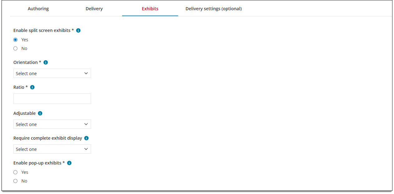
Split-screen exhibits
Field

Description

Enable split screen exhibits

Enables or disables the ability for authors to add split screen exhibits to the item.

  • Yes allows authors to add split screen exhibits to the item. 
  • No disables split screen exhibits. 
Orientation

Determines where exhibits are displayed on the screen during test delivery in relation to other item content by default*. For example, "Left" places exhibit content on the left side of the screen and question/response content on the right side.

Note Exhibits will always show on the left side of the screen when authoring the item. Orientation sets exhibit placement only for test delivery, or what the candidate will see. However, each orientation option can be viewed by authors using the Preview option. 

Note Authors can change this setting at the item level in the Authoring application.

Ratio

Determines how much screen space the exhibit will occupy (i.e., the ratio of exhibit content to other item content in terms of screen space). You must enter a value between 0 and 1 up to one decimal place (e.g., "0.5" not "0.55") or use the arrows to set the default* ratio. 

For example, "0.4" sets the exhibit content to occupy 40% of the screen and all other content to occupy 60%. 

Note Authors can change this setting at the item level in the Authoring application.

Adjustable

Determines if the candidate can click and drag to adjust the size of the split screen exhibit (the amount of space occupied by the exhibit versus the item content). 

  • True: Candidates can adjust the size of the split-screen exhibit display. 
  • False: Candidates cannot adjust the size of the split-screen exhibit display. 
Require complete exhibit display

Determines if the candidate is required to view the entire contents of the exhibit before proceeding to the next item. 

  • True: Candidates must view all contents of the exhibit (including any required scrolling) in order to proceed to the next item. 
  • False: Candidates are not required to view all contents of the exhibit (including any required scrolling) in order to proceed to the next item. 

Pop-up exhibits

Field

Description

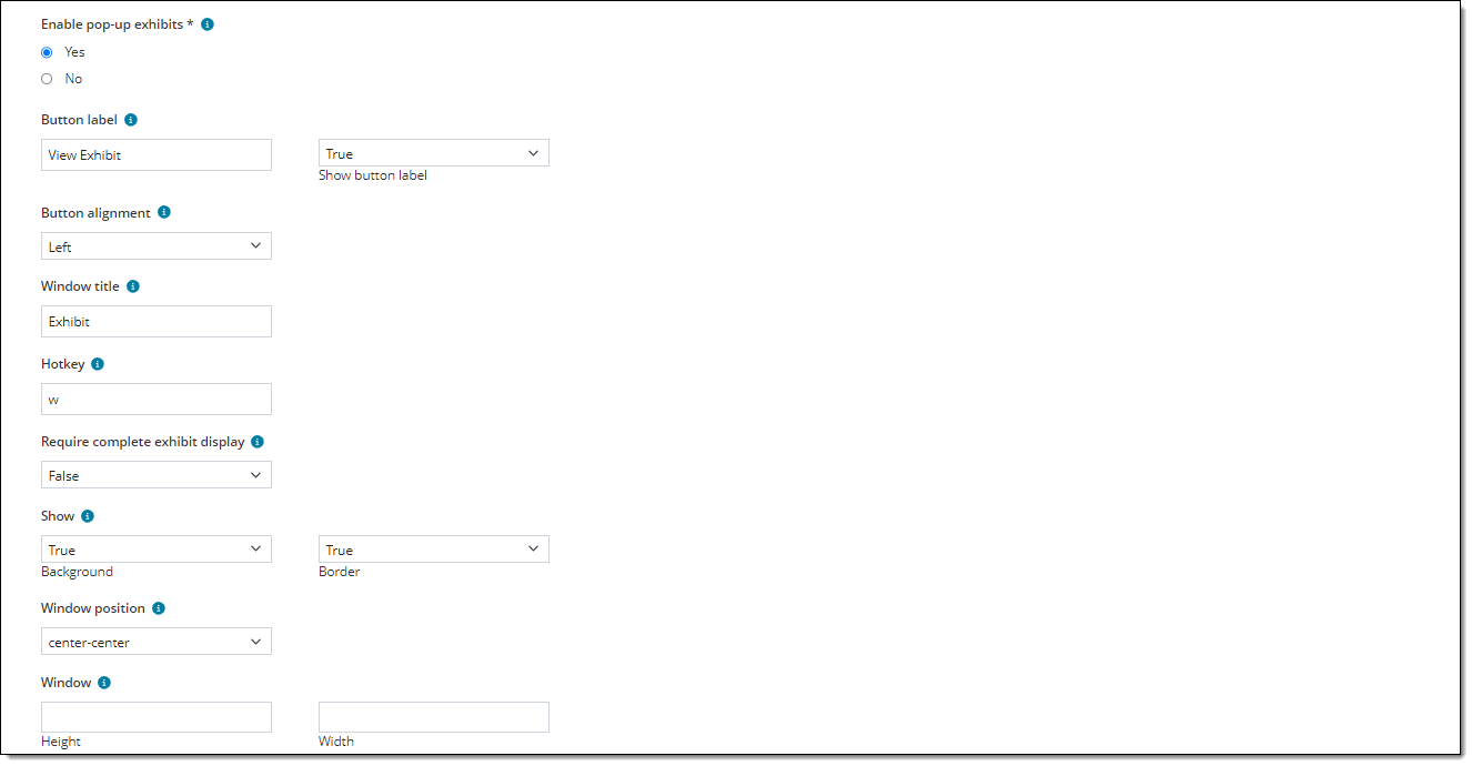
Enable pop-up exhibits

Enables or disables the ability for authors to add pop-up exhibits to the item.

  • Yes allows authors to add pop-up exhibits to the item.
  • No disables pop-up exhibits. 
Button label

Enter text to be displayed on the button; for example, "View Exhibit". If you don't enter any text, the label will default to "Exhibit". 

Show button label

Choose one of the following: 

  • True: The text you entered in the Button label field will be displayed on the button. ("Exhibit" will be displayed if no text is entered for the Button label and Show button label is set to True.)
    A button with the word "Exhibit" and an image of an easel displayed on it.
  • False: The button will not show any text and only an icon will be displayed on the button.
    A button with just an image of an easal.
Button alignment

Choose an option to configure where the exhibit button is displayed on the screen during test delivery in relation to the item content components. 

  • Left: The exhibit button is aligned with the far left side of the item content components. 
  • Center: The exhibit button is aligned with the center of the item content components. 
  • Right: The exhibit button is aligned with the far right side of the item content components. 
Window title

Enter text to be displayed across the top of the exhibit pop-up window; for example, "Exhibit". 

Hotkey

Enter a single alphanumeric character that can be used in conjunction with the Alt key on the keyboard to open the exhibit. 

Require complete exhibit display

Choose one of the following options: 

  • True: Candidates must view all contents of the pop-up exhibit window (including all tabs if multiple exhibits are included) before they can select a response for the item. 
  • False: Candidates are not required to open the exhibit or view all of the contents. 
Show (Background)

Choose one of the following options: 

  • True: The default background color of the button is displayed during test delivery. 
  • False: The default background color of the button is not displayed during test delivery (the button color is transparent). 
Show (Border)

Choose one of the following options: 

  • True: The border of the button is displayed during test delivery. 
  • False: The border is not displayed during test delivery. 
Window position

Choose an option to configure where the pop-up exhibit window is opened on the screen by default* when the exhibit button is clicked. For example, top-right opens the exhibit window in the top-right corner of the screen, while center-center opens the window in the center of the screen.

Note Candidates can click and drag the pop-up window around the screen to the desired location. 

Window (Height, Width)

If desired, enter a specific height and width for the pop-up exhibit window. To use the default size, leave these fields blank. The values you enter will specify a percentage of the screen resolution used during test delivery. 

  • The values must be a non-zero integer; no decimals are permitted.


Media tab

Choose media settings for items that contain audio or video.

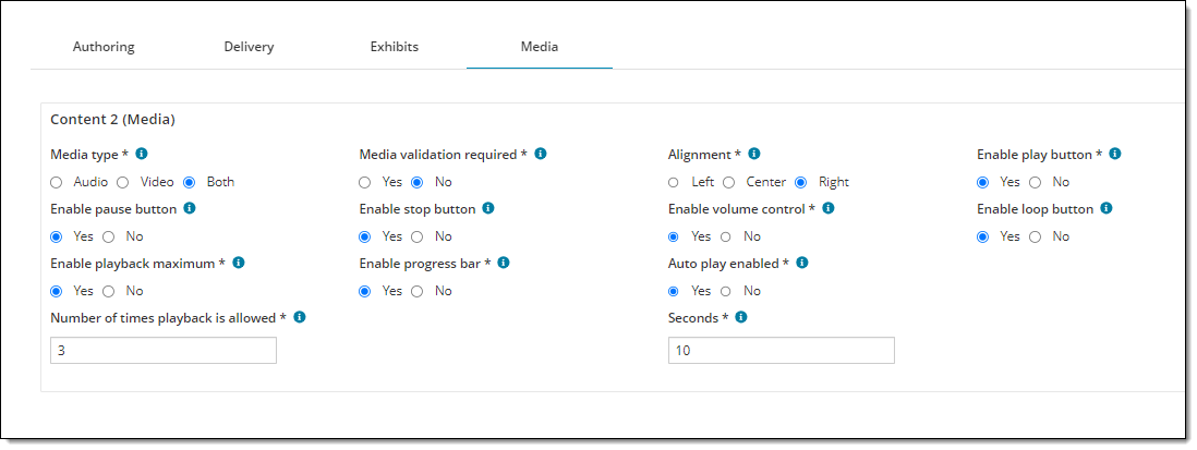
  • The Media tab is not visible until a Media component has been added on the Authoring properties tab. If multiple Media components are added, a separate section is shown for each component ("Content 1", "Content 2", etc.). You must choose settings for each Media component.
  • Media files must be hosted in the Media Content Deployer application before they can be added to an item.
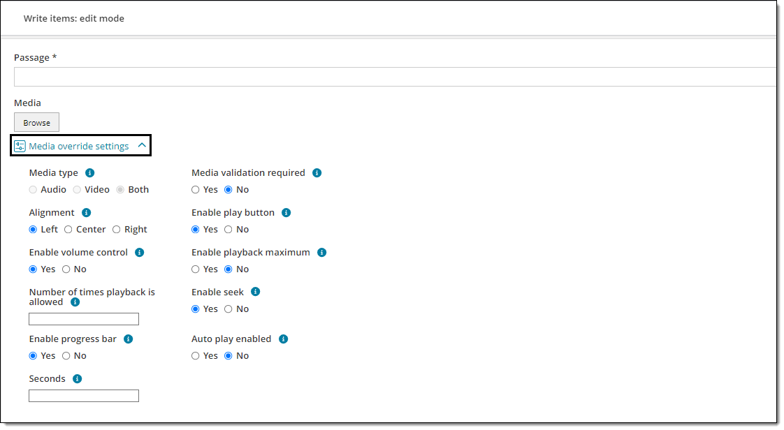
  • Item bank managers can override media settings in the Authoring application by expanding the Media override settings menuMedia override settings menu.  
Field

Description

Media type

Determines which type of media can be added by authors (Audio, Video, or Both). 

Note When browsing for media files to add, authors will only see files that match the supported file type for the selected media (e.g., only audio file types for Audio, only video files for Video, or all media files for Both). 

Media validation required

Determines whether or not authors are required to add a media file to a Media section before they can submit the item. 

  • Yes: Authors are required to add a media file before submitting the item. The item can still be saved without adding a media file. 
  • No: Authors are not required to add a media file before submitting the item. 
Alignment

Determines where the media player is aligned on the screen (left, center, or right) during test delivery. 

Enable play button

Enables (Yes) or disables (No) the play button on the media player.

Enable pause button

Enables (Yes) or disables (No) the pause button on the media player. 

  • If Yes, the media file can be paused. When the play button is clicked after pausing, the media will continue playing from the point where it was stopped. 
  • If No, the media file can only be stopped and cannot be paused. Each time the media file is stopped it will return to the beginning of the clip. 
Enable stop button

Enables (Yes) or disables (No) the stop button on the audio or video player.

If you disable the stop button, the entire media file will be played without stopping unless a pause button is enabled. 

Enable volume control

Enables (Yes) or disables (No) the volume control slider on the audio or video player.

Note If No is selected, volume control is hidden and the loudest volume level will be used by default. If you plan to disable volume control, make sure to test the media clip to ensure an appropriate volume level for test delivery. 

Enable loop button

Enables (Yes) or disables (No) the loop button on the media player. 

Note The loop button will not work unless a play button is also enabled.  

  • If Yes, the media will continuously replay itself once the play button is clicked, unless the pause or stop button is clicked (in which case a pause or stop button must be enabled). If a playback maximum is set, the media will loop itself until the maximum number of playbacks is reached. Note: the stop button is disabled if playback maximum is set, so only a pause button can be used to manually stop looping once it is started. 
  • If No, the media cannot be looped and the play button must be clicked each time the user wishes to play the media clip. 
Enable playback maximum

Allows you to set a limit on the number of times a media file can be played by the candidate during test delivery.

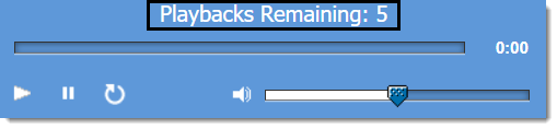
The media player is shown with the text "Playbacks Remaining: 5" at the top.

 If a playback maximum is set, the seek and stop functions will be disabled during test delivery. (The seek bar and stop button will not be shown on the media player.)  

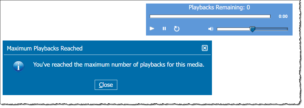
  • Yes: enforces a limit on the number of times the media can be played. You must also enter a number in the Number of times playback is allowed. The number of remaining playbacks is shown on the media player, and a pop-up message is displayed if the candidate reaches the maximum number of playbacks. See exampleSee example


  • No: the media can be played an unlimited number of times and no playback maximum is displayed on the media player. 
Number of times playback is allowed 

Note This configuration is only shown if Yes is selected for Enable playback maximum.

The maximum number of times the media can be played. For example, if "5" is entered candidates can only play the media five times total during test delivery.  

Enable progress bar

Enables (Yes) or disables (No) the progress bar on the audio or video player.

The media player is shown with the progress bar at the top.

  • If Yes, candidates can see how much time has elapsed or is remaining. 
  • If No, candidates cannot see how much time has elapsed or is remaining.  
Auto play enabled

Enables or disables media auto play. 

  • If Yes, the video or audio starts playing once the item is displayed.
  • If No, the Play button must be clicked for the media to start. 
Seconds

Note This configuration is only shown if Yes is selected for Auto play enabled.

Enter the number of seconds that should pass before the audio or video is automatically played. Countdown starts from the time the item is displayed or navigated to during test delivery. 

Enable seek

Note This configuration is only shown if No is selected for Enable playback maximum.

Allows users to manually move forward or backward on the media timeline by dragging a slider. 

Note In order for the seek function to work, the progress bar must also be enabled. 

  • If Yes, the progress bar will include a slider that users can drag back and forth along the media timeline. 
  • If No, the progress bar (if enabled) will only show the time elapsed; no slider will be available. 

Delivery settings tab

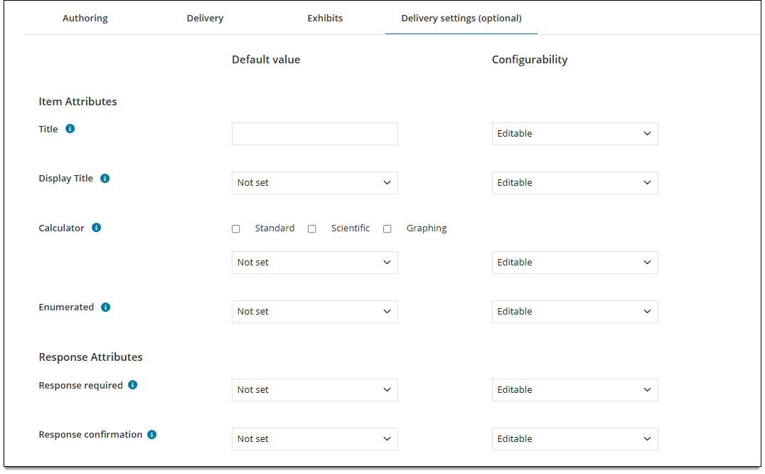
Choose default settings for item and response attributes that are used or displayed during exam delivery, such as shuffled responses, response confirmations, and calculators. 
Item attributes

Note Any field with a Configurability set as Select one will be hidden from writers and reviewers at the item level. (Project Managers will always see it.)

Field

Description

Title

Default value

  • Enter a default item title. The title will display on the item review screen during exam delivery if idents are hidden and Display title (see below) is set to True. 

Configurability 

  • Editable: Authors can change the title for an item. 
  • Viewable: The title will display grayed out so that writers and reviewers can see it, but not change it. (Project managers can still override in Authoring.)
  • Select one: The field will be hidden from writers and reviewers at the item level. (Project Managers will always see it.)
Display title

Default value

  • Select True to display the item's title during exam delivery, or False to hide it during exam delivery (only ExamDeveloper users can see the title). The title will display on the item review screen during exam delivery if idents are hidden and a Title has been added (see above).
  • If you select Not set, no QTI values for this setting will be exported.

Configurability 

  • Editable: Authors can change the True or False selection. 
  • Viewable: The field will be grayed out so that writers and reviewers can see what the current setting is, but they cannot change it. (Project managers can still override in Authoring.)
  • Select one: The field will be hidden from writers and reviewers at the item level. (Project Managers will always see it.)
Calculator

Default value

  • Select Standard, Scientific, and/or Graphing. The options you select determine which calculator types and combinations are available for the author to select and apply to the item. 
  • If you select a calculator type or combination of types from the drop-down menu, that option you select will be selected by default for all items using this template. Authors and reviewers can still change it (if Configurability is set to Editable). If you choose Not set, no calculator types are selected by default and the author/reviewer will choose a type .

Configurability 

  • Editable: Authors can change the calculator type. 
  • Viewable: The field will be grayed out so that writers and reviewers can see which calculator is used but cannot change it. (Project managers can still override in Authoring.)
  • Select one: The field will be hidden from writers and reviewers at the item level. (Project Managers will always see it.)
Enumerated 

Default value

  • Select False to exclude items using this template from the numbering sequence in the review screen, or select True to include them. If you select Not set, no QTI values for this setting will be exported. About enumerationAbout enumeration

    By default, all items are numbered in the review screen. When you exclude an item from numbering, the next item in the list uses the subsequent numbering. For example, if the first item is excluded from the numbering; the second item is assigned the value of 1. If the fifth item is also excluded from the numbering, the sixth item is assigned the number 4.

Configurability 

  • Editable: Authors can change the True or False selection. 
  • Viewable: The field will be grayed out so that writers and reviewers can see what the current setting is, but they cannot change it. (Project managers can still override in Authoring.)
  • Select one: The field will be hidden from writers and reviewers at the item level. (Project Managers will always see it.)

Response attributes

Field

Description

Shuffle response 

Default value

Determines if the 'shuffle response' feature is enabled for this item.

  • Select Yes to enable shuffled responses (response options will be displayed in a random order) or No to disable shuffled responses (response options will always be displayed to candidates in the same order - which is the order displayed in the item editor). If you select Not set, no QTI values for this setting will be exported. 
  • Note For Grid multiple choice - one correct and Grid multiple choice - multiple correct templates, this field will always be set and exported as "No" and cannot be changed in ExamDeveloper.

Configurability 

  • Editable: Authors can change the True or False selection. 
  • Viewable: The field will be grayed out so that writers and reviewers can see what the current setting is, but they cannot change it. (Project managers can still override in Authoring.)
  • Select one: If you select Not set, no QTI values for this setting will be exported. 
Response required

Default value

Determines if the candidate must enter a complete response for the item before navigating away from it.

  • Select True to require a response (a message is displayed if the response is incomplete or unanswered and the candidate is unable to proceed until a response is entered) or False to allow candidates to proceed without answering the item completely. If you select Not set, no QTI values for this setting will be exported. 

Configurability 

  • Editable: Authors can change the True or False selection. 
  • Viewable: The field will be grayed out so that writers and reviewers can see what the current setting is, but they cannot change it. (Project managers can still override in Authoring.)
  • Select one: The field will be hidden from writers and reviewers at the item level. (Project Managers will always see it.)
Response confirmation

Default value

Determines if candidates will be prompted to confirm their answer to an item before navigating away from it. This is often used for exams that don't allow candidates to go back to an item once it has been answered.  

  • Select True to enforce the confirmation prompt or select False to disable the prompt and allow candidates to proceed without confirming. If you select Not set, no QTI values for this setting will be exported. 

Configurability 

  • Editable: Authors can change the True or False selection. 
  • Viewable: The field will be grayed out so that writers and reviewers can see what the current setting is, but they cannot change it. (Project managers can still override in Authoring.)
  • Select one: The field will be hidden from writers and reviewers at the item level. (Project Managers will always see it.) 
No response confirmation

Default value

Determines if the candidate must enter a complete response for the item before navigating away from it. 

  • Select True to require a response (a message is displayed if the response is incomplete or unanswered and the candidate is unable to proceed until the response is complete) or select False to allow candidates to proceed without answering the item completely. If you select Not set, no QTI values for this setting will be exported. 

Configurability 

  • Editable: Authors can change the True or False selection. 
  • Viewable: The field will be grayed out so that writers and reviewers can see what the current setting is, but they cannot change it. (Project managers can still override in Authoring.)
  • Select one: The field will be hidden from writers and reviewers at the item level. (Project Managers will always see it.)