Search
Add new views
Create custom views for search. You can add or remove columns, change the left-to-right order of columns, and apply filters for properties such as item type or blueprint area.
|
|
Add a new view
- Click the Viewing menu in the upper-right corner of the page and do one of the following:
- Select +Add new view.
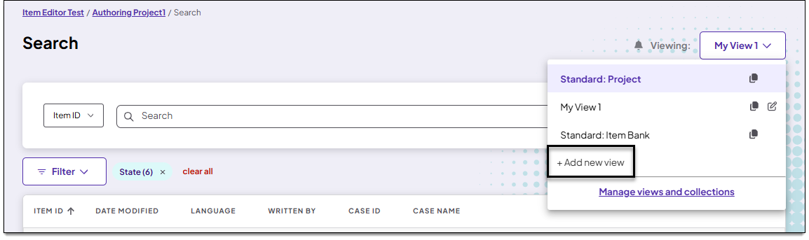
- Click
 for another view. This starts a new view based on the properties of the copied view.
- Select +Add new view.
- On the Add view page:
- Input a name and description for the view in the View name and Description fields.
- If you want this view to be shown by default when you launch the Search page, turn Set view as default on
 .
- Configure columns and filters for the view as described in the following sections.
Add columns
Choose which columns will be included on the Search page.
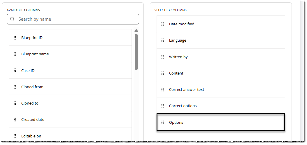
- Click and drag columns from the Available Columns list to the Selected Columns list to add them to the view. Or, find a specific column by typing its name in the search bar. See column descriptions ↓ for more details on each column.
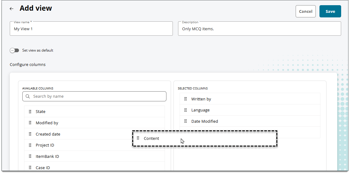
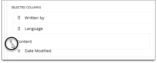
- To reorder a column, click the
 for the column and move it up or down in the list. The order of columns from top to bottom in this list will be displayed as the left-to-right order of columns on the Search page.
Column descriptions
 Some columns may refer to a property of an item at either the project or item bank level, depending on your permissions (item bank manager or project manager) and what view type you are using (Project view or Item Bank view). For example, the "Collections" column shows either all collections within the item bank that an item belongs to, or only the collections with the current project that an item belongs to.
- Asset indicator: displays an indicator icon
 for items that contain an asset in the text or media content components, response options, and/or background images.
- Asset name: displays all assets used in an item. Includes assets used in text or media content components, response options, and/or background images.
- Up to 20 characters of the asset name will be displayed on the search results page; additional characters won't be visible unless exported.
- Blueprint ID: the numerical portion of a blueprint area, such as "1" or "1.1".
- Up to five levels of nested blueprint levels will be shown.
- Blueprint name: the named portion of a blueprint area, such as "Fruits" or "Apples".
- Up to 30 characters of the blueprint name will be displayed on the search results page; additional characters won't be visible unless exported.
- Case ID: the ID that is auto-assigned to a case.
- Case name: the name of the case (specified in the Name field in the Case panel in Authoring).
- Up to 50 characters of the blueprint name will be displayed on the search results page; additional characters won't be visible unless exported.
- Cloned from: the item ID from which an item was cloned. For example, if you cloned item 12345 to create item 23456, "12345" would be shown in the Cloned from column for item 23456.
- Cloned to: the item ID of the new item to which the item was cloned. For example, if you cloned item 12345 to create item 23456, "23456" would be shown in the Cloned to column for item 12345.
- Up to 6 characters (including spaces) will be displayed on the search results page; additional characters won't be visible unless exported.
- Collections: the collections that an item belongs to. Both editable and viewable collections will be shown.
- Up to 50 characters of the collection names will be displayed on the search results page; additional characters won't be visible unless exported.
- Comments: the comment flag, comment text, user name, and date associated with a comment on the item.
- Content: the content of the item, including the question and responses. If needed, you can hover your mouse pointer over the Content for an item to display more content.
- Up to 100 characters of the item content will be displayed on the search results page; additional characters won't be visible unless exported.
- Correct answer text: text contained in the 'correct' response option for an item. When this column is added to a view, you can perform a content search to find items that contain specific content within the correct answer.
- Correct options: the identifier of the correct response option (key) for an item. For example, if the correct response in a Multiple Choice item has the identifier of "A", this column would show "A". A comma-separated list is displayed for items with multiple correct response options (e.g., "A, B, C" or "R1 3 | R2 4").
- Up to 12 characters of correct option identifiers will be displayed on the search results page; additional characters won't be visible unless exported.
- Created date: the date the item was first created and saved in ExamDeveloper.
- Delivery settings (multiple columns): the current Delivery settings for each item (known as “advanced properties” in legacy projects). You can add any of the following as separate columns in the search results: Title, Display title, Calculator, Enumerated, Shuffle Response, Response Required, Response Confirmation, No Response Confirmation. If no values are set for the item, the column value will be blank in the search results.
- The Title field is also used for the title of a Display item. If both values apply to an item in the search results, the column will be shown twice (once for the Display title and once for the Delivery setting).
- Date modified: the date that an ExamDeveloper user modified the item. (You can add the Modified by column to see the user's name.)
- Editable on: the name of the project an item is editable for. This column will contain only one project since an item can only be edited in one project at a time.
- Enemies: if an item has enemy relationships, this column shows the item IDs of those enemies. (Depending on the setting chosen for the Enemies filter, this column may exclude enemies that are not displayed in the current search results.)
- Up to 30 characters (including spaces) will be displayed on the search results page; additional characters won't be visible unless exported.
- Exam Forms: the exam forms that an item belongs to. Both editable and viewable forms will be shown.
- Up to 50 characters of the form names will be displayed on the search results page; additional characters won't be visible unless exported.
- Exhibit reference: the type (split screen or popup) and ID of any exhibits that are referenced in the item.
- Up to 60 characters (including spaces) will be displayed on the search results page; additional characters won't be visible unless exported.
- Item ID: the auto-assigned ID for an item.
- Item source: indicates how the item was added to ExamDeveloper (ExD = added manually, IA = generated with Item Assist).
- ItemBank ID: the ID auto-assigned to the item bank. (This column is only available to item bank managers.)
- ItemBank name: the name given to the item bank. (This column is only available to item bank managers.)
- ItemType name: the custom name of the item type template variation applied to the item, such as "Multiple choice one correct with media options". (This is distinct from the Template name column, which shows the name of the universal template from which variations can be created, such as "Multiple choice - one correct".)
- Language: the language associated with the item (English if no translations are imported).
- Latest revision: the current revision number of the item (the item's most recently created revision).
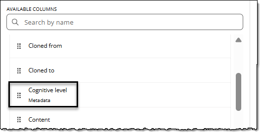
- Metadata fields: displays any metadata applied to the item. (Both editable and viewable metadata will be shown.) Each metadata field configured for a project or item bank will be available as a separate column. Column header labels will match the metadata name. For example, if your project has a dropdown list metadata field named "Cognitive level", you'll see "Cognitive level" as a column option with a marker to indicate it's a metadata field.
- Up to 40 characters of the applied metadata will be displayed on the search results page; additional characters won't be visible unless exported.
- Modified by: the name of hte ExamDeveloper user who modified the item. This column is best viewed alongside the Date modified column.
- Options: shows the content of response options for each item. Each option will populate a new column in the search results (such as "Option A", "Option B", etc.). For example, if a search returns items with four options as well as items with five options, you'll see a total of five added columns in the search results. Items that have only four options will have a fifth column that is empty/null. If the search is exported, all possible options columns will be exported.
- The Options column is automatically added to the bottom of your Selected Columns list and cannot be moved, since the number of columns and column labels may differ for each item and are always displayed at the far-right end of the search results table.
- Additional columns are also displayed for certain item type templates. View additional columns View additional columns
- Header: shown for Grid multiple choice templates; this shows the header row text for the response grid. Up to 8 characters of the header will be displayed on the search results page; additional characters won't be visible.
- pearsonvvueResponse: the response passage for templates such as Drop down and Selectable Text. Up to 50 characters of the pearsonvueResponse passage will be displayed on the search results page; additional characters won't be visible.
- Response fields (R1, R2, etc.): shown for templates such as Multiple choice - one correct - Multiple response and Grid multiple choice. Up to 50 characters of the Response field will be displayed on the search results page; additional characters won't be visible.
- Header: shown for Grid multiple choice templates; this shows the header row text for the response grid.
- Up to 8 characters of the options text will be displayed on the search results page; additional characters won't be visible unless exported.
- Other blueprints: shows additional blueprints configured for the item bank.
- Project ID: the ID auto-assigned to an ExamDeveloper project.
- Project name: the name of the ExamDeveloper project.
- Review state: the custom name/label for a review workflow status, such as "Peer Review".
- Revision source: indicates how a revision of an item was made in ExamDeveloper (ExD = edited manually, IA = revision generated with Item Assist).
- Sections: the exam sections that an item belongs to. Both editable and viewable sections will be shown.
- Up to 50 characters of the section names will be displayed on the search results page; additional characters won't be visible unless exported.
- State: the item’s status in ExamDeveloper (Completed, Draft, Imported, Obsolete, Returned, Review, Validate).
- Stem or other 'content components': Column header labels will match the component label in the item template. For example, if a template has two components named "Stem" and "Directive", you can add the Stem column and/or the Directive column. If you add just Stem and not Directive, you'll only see content for the Stem component in the search results. If multiple item types share the same component label, they will be included in the same column. (You won't see two distinct "Stem" columns.)
- Up to 50 characters of content within the component will be displayed on the search results page; additional characters won't be visible unless exported.
- Template ID: the ID auto-assigned to a template when it is created.
- Template name: the name of the universal item type template applied to the item, such as "Multiple choice - one correct". (This is distinct from the ItemType name column, which shows the custom name of a variation of the universal template, such as "Multiple choice one correct with media options".)
- Title: the title of a Display item, if used.
- Up to 255 characters of the title will be displayed on the search results page; additional characters won't be visible unless exported.
- Translation group ID: the ID that identifies a source item and connects it with any of its translations. (The translation group ID is the ID of the source item).
- Up to 6 characters of the translation group ID will be displayed on the search results page; additional characters won't be visible unless exported.
- Viewable on: the name of all projects for which an item is viewable.
- Written By: the ExamDeveloper user who created the original version of the item.
Add filters
Apply filters to limit which items that are shown on the Search page.
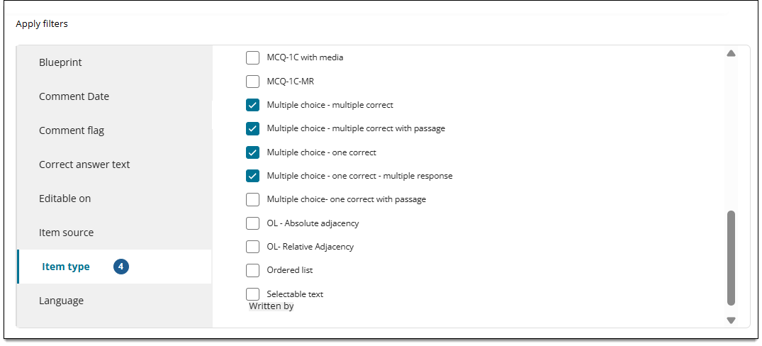
- Select a filtering category in the left panel to display the available options. (See filter descriptions below ↓ for more details on each filter.)
- Select options for the filter in the right panel. The options you select will refine the items that are included in the search results when this view is selected on the Search page.
- Click Save.
Asset
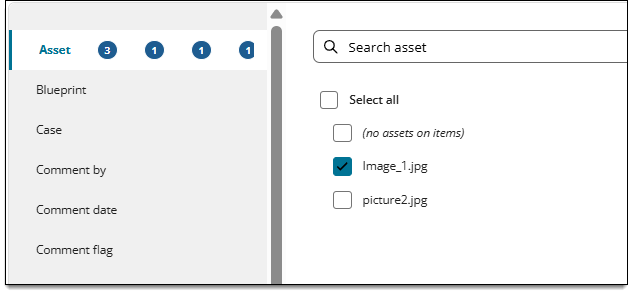
Filters for items that contain any assets, do not contain any assets, or contain certain assets.
- Choose Select all to filter for all items associated with any asset.
- Choose no assets on items to filter for items that do not contain any assets.
- Choose one or more specific assets. If needed, you can search for a particular asset type (e.g., "MP4") or name (e.g., "Video1.mp4"). The search results will only include items with the assets you selected.
Blueprint
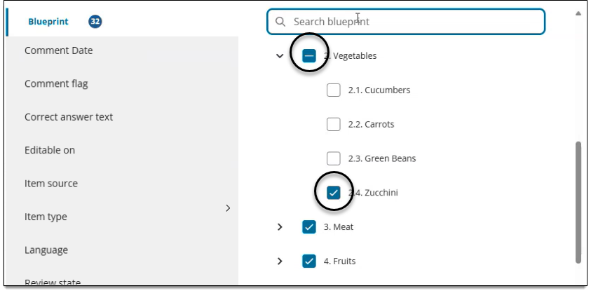
Filters for items associated with selected areas of the project blueprint
- You can choose Select all to filter for all items associated with the entire blueprint (which will include all levels and any sub-levels):
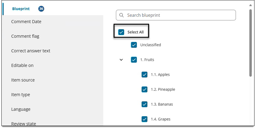
- Or, you can select specific areas and/or sub-areas to filter for items that are only associated with the sub-areas you selected:
Case
Filter for items that are either part of a case or not part of a case.
- To filter for items that are part of any case, select the Select all checkbox and then deselect the Items not on cases checkbox.
- To filter for items that are not part of a case, select the Items not on cases checkbox.
- To filter for a group of specific cases, select the check box for the desired cases.
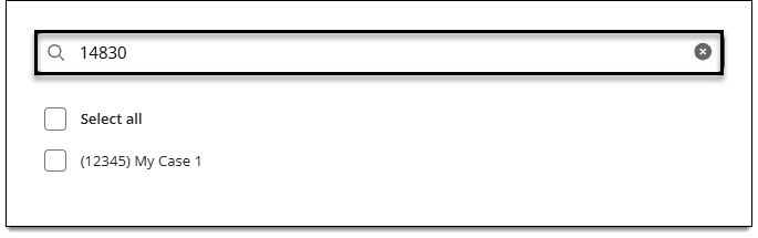
- To filter for a single specific case, type the case name or ID into the search bar and select its checkbox (if the case is found).
Collections
Filters for items that are included or excluded from collections. The following general conditions can be configured:
- Items that belong to any collection
- Items that belong to specific collections
- Items that are excluded from all collections
- Items that are excluded from specific collections
To configure the filter, first choose a condition:
- Include: Search results will return items that are included in the collections you select.
- Exclude: Search results will return items that are NOT included in the collections you select.
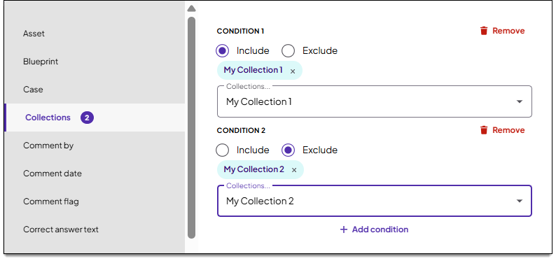
Next, select the collections that correspond to the include or exclude condition. For example, if you want to filter for items that are included in Collection 1, select only "Collection 1".
Then, click Add condition to specify additional conditions (if needed). For example, if you want to filter for items that are included in Collection 1 and NOT included in Collection 2, you would make the selection as shown below:
Filter for items in ANY collection
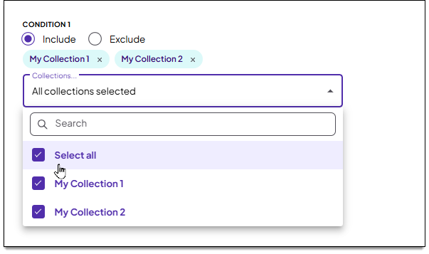
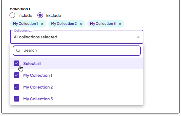
To filter for items in any collection, choose Include as the condition and click Select all from the collections menu.
Filter for items NOT included in any collection
To filter for items that are NOT included in any collection, choose Exclude as the condition and click Select all from the collections menu.
Filter for items in at least one of the specified collections ("OR" logic)
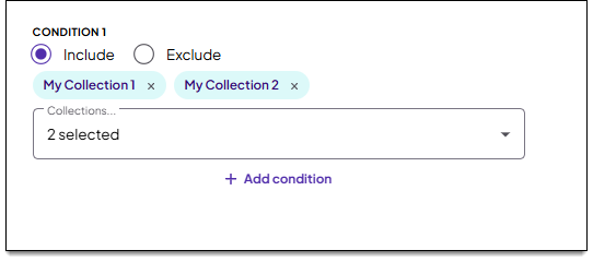
To filter for items in at least one of hte collections you specify, create only one Include condition that contains all of the eligible collections. For example, the selection below returns items that are in either Collection 1 or Collection 2 (or both).
Filter for items in all of the specified collections ("AND" logic)
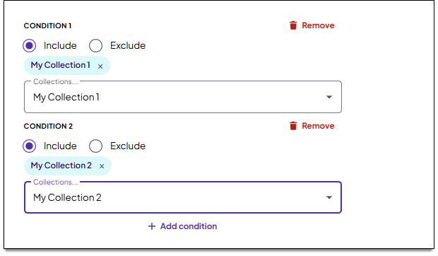
To filter for items that are included in all of the collections you specify, create one condition for each collection. For example, the selection below returns items that are in both Collection 1 and Collection 2.
Comment date
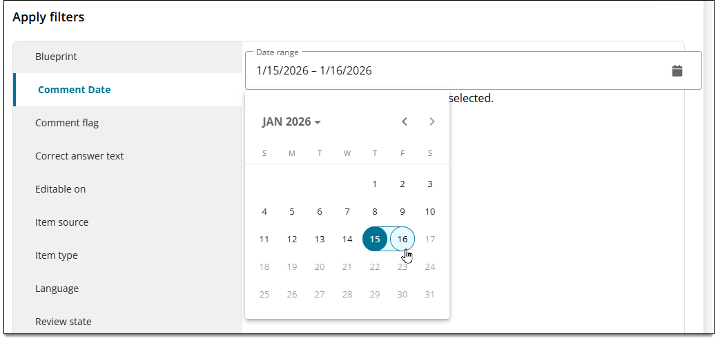
Filters for items by the date a comment was added to the item. Click the calendar icon  to choose a date range. You are required to select a start date and an end date. To choose a single date, select the same date for both the start and end date.
Comment flag
Filters for items by the comment flag that was selected when adding a comment to the item.
Correct answer text
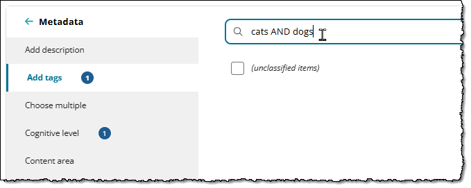
Filters for items by text contained in the 'correct' answer option. You can use a combination of AND, OR, and NOT operators as well as parentheses to specify certain words and phrases, just as you would for other content searches.
Editable on
Filters for items that are editable in certain projects. Include a list of all projects in alphanumeric order within the item bank, regardless of your access to the projects. Inactive projects will also be included. When you select specific projects from the list, only items that are editable in those projects will be included in search results.
Enemies
Determines if all enemy relationships for each item in the search results are shown, including enemy items that are not included in your current search results.
Choose Yes or No for "Would you like to show only enemies included in the returned results?"
- No (default): Enemy relationships with items that are not in the results are included. For example, if you perform a refined search and 10 items are returned, those 10 items can be included in the Enemies column along with any other associated enemies in the project.
- Yes: Enemy relationships with items that are not in the search results are excluded. For example, if you perform a refined search and 10 items are returned, only those 10 items may be shown in the Enemies column, even if the items have other enemies that are not included in the refined search results.
The Enemies column ↑ must be added to your search view in order to see the enemy relationships displayed for each item in search results.
Item source
Filters for items based on how the item was added to ExamDeveloper (ExD = added manually, IA = generated with Item Assist).
Item type
Filters by the item type template associated with the item.
The Legacy option filters for any and all items shared to the project that were authored in the legacy editor, regardless of the legacy template that is applied to the item. To exclude all Legacy items from the search results, make sure this option is NOT selected.
Language filter
Filters by the language associated with the item.
Metadata filter
Filters by the metadata field applied to the item.
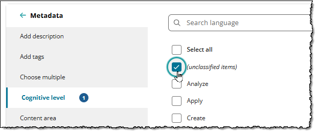
- For single line text, block text, or multi-entry text metadata, you can search for items that have an empty value for the metadata field, or you can search for specific content within those fields.
- To find items that do not have an entry in the metadata field, select (unclassified items). This will return items that have an empty value for that metadata field.
- To find specific content within a metadata type, input content in the search box (using the same operators used for the content search).
Review state
Filters by the item’s current Review workflow status in the ExamDeveloper project. (This could be "Default" or a custom review status such as "Peer Review").
This filter is only available for Project views; it is not available for Item Bank views.
State
Filters by the item’s overall status in ExamDeveloper (Completed, Draft, Imported, Obsolete, Return, Review, or Validate).
Written by
Filters by the last name of the user(s) who wrote the item. Any users that have written an item within the project will be available to select in the list of options. Items can be editable or viewable within the project.
Written date
Filters by the date (or a range of dates) when items were first written (or imported into ExamDeveloper, if applicable). Items can be editable or viewable within the project.
Click the to choose a date range. You are required to select a start date and an end date. To choose a single date, select the same date for both the start and end date.
Save the view
- When you're done adding columns and filters, click Save.
- You can now access this view from the Viewing menu in the upper-right corner of the Search page.
- If you select this view as the default, it will be shown by default each time you log in to the Search page.
- You can also edit this view or manage all views.